
Screen Modifier — Edit-Screen Modifications
This page covers everything you can change about an edit screen — the screen a user opens to view or enter a single record. If you are working on list views or selector pop-ups instead, see List View & Selector Pop-up.
An edit screen is built from pages (the tabs across the top), and each page holds blocks. A block is one of: a group of header fields, a grid of detail lines, an actions block of buttons, or a special block such as the discussion area, an embedded report, or a dashboard. Almost every collection below targets one of these building blocks.
TIP
Most of these changes are far easier to make visually. The Visual Layout Editor lets you add, move, rename and delete pages, groups, grids, fields and actions by hand and writes the result back into the same collections described here. Use the tables below when you want to understand exactly what each option does, or when you prefer to fill the record directly.
Throughout this page, anywhere you are asked for a field, you enter its field id (the property path, such as lines.item or customer.name), not its on-screen label. Most of these fields offer suggestions as you type, scoped to the type(s) in For Type / For Type List.
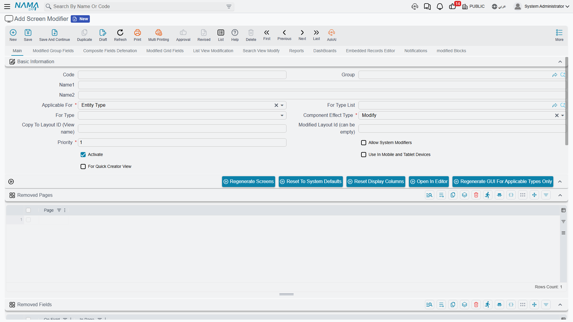
Working with pages (tabs)
| Collection | What it does |
|---|---|
| Add Pages | Adds new, empty pages (tabs) to the screen that you can then fill with groups and grids. |
| Removed Pages | Hides existing pages. You pick the page by its id, suggested from the screen's current pages. |
| Reorder Pages | Changes the order pages appear across the top of the screen. Add one line per page you want to move: pick the page and give it its new position number; pages you don't list keep their existing order. |
Groups of header fields
A group is a titled box of header fields (such as "Basic Data" or "Notes").
| Collection | What it does |
|---|---|
| Add Groups | Adds a new group to a page. You give it an Arabic and English title, choose the page it lives in, and set its order among the other blocks; you can also set the default field layout for the fields you place in it. |
| Modified Group Fields | Changes the fields inside an existing group — which fields appear, their order, and the group's title. You identify the group by its title (suggested from the screen) and place the modifier relative to an existing field. |
Grids of detail lines
A grid is the table of detail lines on a document — invoice lines, journal entry lines, and so on.
| Collection | What it does |
|---|---|
| Add Grids | Adds a new detail grid to a page, with its own Arabic/English title, width, visibility, page and order. |
| Modified Grid Fields | Changes the columns of an existing grid — which columns show, their order, and where they sit relative to an existing column. |
TIP
When adding a grid column that points at a reference (for example lines.account), you can also surface that reference's code, name or image as separate columns. See Reference columns in List View & Selector Pop-up, where the same .code / .name / .image suffixes apply.
Hiding fields and actions
| Collection | What it does |
|---|---|
| Removed Fields | Hides individual fields from the screen. Enter each field's id (suggested as you type) and, optionally, the page it is on. |
| Removed Actions | Hides toolbar/menu buttons (actions) you do not want users to see. You pick the action from the list of the screen's available actions. |
Discussion-block options
Most screens carry a discussion block — the area at the bottom of the record where users add notes, attachments and reference links. Each note can also carry two general-purpose date fields and two time fields (Date 1 / Date 2, Time 1 / Time 2) for recording things like a follow-up date or a call time alongside the note. Without listing individual fields, you can switch off parts of the block directly on the modifier:
- Remove Discussion Field — hides the free-text discussion field.
- Remove Discussion Attachment 1 … 4 — hides each of the four attachment slots.
- Remove Discussion Reference 1 … 2 — hides each of the two reference links.
- Remove Discussion Date 1 / Date 2 — hides each of the two date fields.
- Remove Discussion Time 1 / Time 2 — hides each of the two time fields.
You can also control how much room the note itself takes up with Discussion Field Layout:
- Normal — a compact box that shares its row with a neighbouring field.
- Spanned — a full-width box on a single, compact line.
- Spanned 2 (the default) — a full-width, taller box, giving users more visible room to read and type longer notes.
- Alone — the box sits on its own row with nothing beside it, while keeping the compact width of Normal.
All of these switches sit together in the Modified Discussion Fields group, on the modifier's Modified Group Fields page. For example, to stop users adding references or attachments under the notes on the Sales Invoice screen:
- Open (or create) the Screen Modifier for the type — here
SalesInvoice. - On the Modified Group Fields page, find the Modified Discussion Fields group.
- Switch on the parts you want to hide — say Remove Discussion Reference 1, Remove Discussion Reference 2 and the four Remove Discussion Attachment switches.
- Save the modifier, then run Regenerate GUI For Applicable Types Only (or Regenerate Screens) — see Making your changes take effect.
Reopen a Sales Invoice: the discussion block now shows only the parts you left switched off.
Action Authorities — adding buttons
The Action Authorities collection — the tab is labelled Notifications on screen — lets you add buttons to a screen beyond hiding existing ones. Each line is one button, and what it does depends on which column you fill in: run a report (with its parameters fed from fields on the record), run an entity flow or a notification, open a bulk edit from a list, or — the most open-ended of them — open a link built from the current record, including a link that opens a new, pre-filled record on another screen.
That collection is large enough to have its own page: Adding Buttons to a Screen covers every column, where the button can be placed, and a worked example of a button on the customer file that opens a sales invoice with the customer already filled in.
Formulas — composite header fields
The Formulas collection builds a composite field: a single read-only field whose value is assembled from up to five other fields. You point each slot (first … fifth field) at an existing field on the screen and choose how they combine, then place the result in a page. This is the way to show a concatenated label, a computed display value, or a combined reference without changing the underlying data model.
Embedded Records Editor
The Embedded Records Editor lets the user edit a referenced record directly inside the host screen, instead of opening it separately. On each line you choose:
- the reference field on the host record that points at the object to edit (must be a reference or generic-reference field),
- the view name (layout) to use for the embedded editor,
- an optional default-values template to pre-fill a new embedded record,
- and the page the embedded editor appears on.
For example, on a Sales Order you could embed the customer's edit screen so a clerk can update the customer's data without leaving the order.
One view name does something different: with the entity type set to Technician Appointment, the view TechnicianAppointmentCreator embeds the technician booking calendar for the open document instead of an edit screen — see the calendar embedded in the document.
In-screen reports and dashboards
You can surface analytics and printouts right inside an edit screen:
| Collection | What it does |
|---|---|
| Page Reports | Embeds a report on a page, with its parameters driven by fields from the current record. |
| Page Dashboards | Embeds a dashboard on a page, again with its parameters fed from the record's fields, so the charts reflect the open record. |
Fill Fields From Column
The Fill Fields From Column collection sets up auto-fill behaviour. You nominate a trigger column (typically a reference, such as the customer) and, for that reference, which search field to read from and which field to copy into on the host record. When the user fills the trigger column, Nama copies the chosen value across automatically — a lightweight way to default one field from another without custom code.
Moving blocks between pages
The Page Blocks collection moves a block from one page to another: you state the block, the page it currently lives on (from page), and the page it should move to (to page). This is handy for reorganising a busy screen — for example, pulling the attachments group onto its own tab.
See also
- Overview & Concepts — applicability, Modify vs. Copy, priority, and how to make changes take effect.
- Visual Layout Editor — do all of the above by dragging on a canvas.
- List View & Selector Pop-up — for changes to lists and search pop-ups.