BI Reference — EnhancedMetricsCard (and legacy MetricsCards)
Companion to bi-module-technical-reference.md. Load this for type: "EnhancedMetricsCard" (modern, JSON-driven) or type: "MetricsCards" (legacy, value-object driven).
EnhancedMetricsCard reads chartConfigJSON end-to-end, supports embedded sparklines, conditional card backgrounds, icon swaps, and the full BI interaction stack (cross-filter / drill-down / link). The legacy MetricsCards widget continues to coexist; opt into the new one via type: "EnhancedMetricsCard".
1. When to use which
- Quick KPI strip — header / value / subtitle / icon, optional percent badge → legacy
MetricsCards(no JSON authoring; no sparklines or conditional bg either). - Anything richer — sparklines, conditional card colors, drill-down per card, partition-driven aggregation across multiple SQL rows →
EnhancedMetricsCard.
Either way, what lands on the dashboard is a strip of cards like this one:

2. Legacy MetricsCards (type: "MetricsCards")
Reads a top-level metricsCardConfig value object on the DashBoardWidget itself — not chartConfigJSON. One card per SQL row. Tempo strings substitute {columnName} against the row.
{
  "code": "kpi-summary",
  "name1": "ملخص",
  "name2": "Summary",
  "type": "MetricsCards",
  "dataSource": "SELECT 1 sortOrder, N'YTD Payroll' headerEn, N'إجمالي الرواتب' headerAr, 1234567 cardValue, N'Year to date' subtitleEn, N'منذ بداية العام' subtitleAr, 'attach_money' iconCode UNION ALL ... ORDER BY sortOrder",
  "metricsCardConfig": {
    "headerTempoAr":   "{headerAr}",
    "headerTempoEn":   "{headerEn}",
    "valueTempo":      "{cardValue}",
    "subtitleTempoAr": "{subtitleAr}",
    "subtitleTempoEn": "{subtitleEn}",
    "iconCode":        "{iconCode}",
    "numberFormat":    "0,0",
    "suffix":          " SAR"
  }
}| Field | Description |
|---|---|
headerTempoAr / headerTempoEn | Header template with {col} substitution. |
headerColumnAr / headerColumnEn | Bare column name (alternative to template). |
valueTempo / valueColumn | Main number — template or bare column. |
subtitleTempoAr / subtitleTempoEn / subtitleColumnAr / subtitleColumnEn | Secondary line. |
iconCode | Material icon name; supports {col} substitution to drive icon per row. |
badgePercentTempo / badgePercentColumn | Optional percent-delta badge (legacy widget's only chart-like decoration). |
linkTempo / linkColumn | Click-through URL — Tempo template or bare column. |
numberFormat | numeral.js mask string ("0,0", "0,0.00", "0a"). Different format language from the structured formatting object used elsewhere. |
suffix | Static string appended after the formatted value (e.g. " SAR"). |
When this shape is enough, the legacy widget is shorter than EnhancedMetricsCard. Move to EnhancedMetricsCard when you need sparklines, conditional card colors, or click-emit/drill-down.
3. EnhancedMetricsCard chartConfigJSON
{
  "cardLayout": {
    "direction":      "row",         // row | grid
    "minCardWidth":   220,           // px; cards wrap below this
    "gap":            12,            // px between cards
    "columnsPerRow":  null,          // null = auto-fit; integer = fixed grid
    "partitionKeys":  []             // optional — see §5
  },

  "card": {
    // Header (optional)
    "headerArTitle":  "إجمالي الموظفين النشطين",
    "headerEnTitle":  "Active Headcount",
    "headerArField":  null,           // OR per-row header from a column
    "headerEnField":  null,

    // Value slot
    "value": {
      "field":      "activeCount",
      "aggregate":  "field",           // field | sum | avg | last | first | max | min
      "formatting": { "type": "number", "decimals": 0, "thousandSeparator": true },
      "fontSize":   "32px",
      "color":      null,
      "colorField": "valueColor"
    },

    // Subtitle (Tempo template)
    "subtitle": {
      "tempoAr": "من إجمالي {totalCount} · {suspendedCount} معلق",
      "tempoEn": "of {totalCount} total · {suspendedCount} suspended"
    },

    // Icon
    "icon": {
      "code":       "people",          // static Material icon
      "field":      null,               // OR per-row column with icon code
      "color":      "#3b82f6",
      "colorField": null,
      "bg":         "#dbeafe",
      "bgField":    null
    },

    // Badge (optional delta indicator)
    "badge": {
      "field":      "deltaPercent",
      "formatting": { "type": "percent", "decimals": 1 },
      "prefixIcon": { "positive": "trending_up", "negative": "trending_down", "zero": "remove" },
      "colorRules": { "rules": [
        { "when": { "type": "threshold", "op": ">=", "value": 0 }, "style": { "color": "#065f46" } },
        { "when": { "type": "threshold", "op": "<",  "value": 0 }, "style": { "color": "#991b1b" } }
      ] }
    },

    // Sparkline (optional)
    "sparkline": {
      "type":           "area",        // line | area | column
      "mode":           "partition",   // partition (default) | inline
      "valueField":     "v",            // partition mode — column collected across partition rows
      "orderByField":   "monthIdx",     // optional; falls back to result-set order
      "orderDirection": "asc",
      "valuesField":    null,           // inline mode — CSV / JSON-array column on a single row
      "color":          "#3b82f6",
      "smooth":         true,
      "height":         40
    },

    // Card-level styling
    "cardStyle": {
      "bg":           "#ffffff",
      "borderColor":  "#e2e8f0",
      "borderWidth":  "1px",
      "borderRadius": "12px",
      "padding":      "16px",
      "shadow":       "sm"               // none | xs | sm | md | lg
    },

    // Conditional card bg / icon swap (§7)
    "cardConditionalFormatting": {
      "cascade": false,
      "rules": [
        { "when": { "type": "threshold", "column": "expiredCount", "op": ">", "value": 0 },
          "style": { "bg": "#fef2f2", "borderColor": "#fecaca", "iconCode": "warning", "iconColor": "#dc2626" } }
      ]
    }
  },

  // Same shape as EnhancedTable / Table — applied per card
  "clickEmitMapping":  [ ],
  "drillDownMapping":  [ ],
  "linkMappings":      [ ],
  "clickAction":       { "type": "crossFilter", "targetKey": "..." }
}
cardLayout.direction
| Value | Behavior |
|---|---|
"row" | Wrap-as-needed strip. Use minCardWidth + gap. Best for chip strips. |
"grid" | Fixed N-per-row (set columnsPerRow). Falls back to auto-fit if columnsPerRow is null. Best for KPI tiles aligned to a grid. |
4. Card-to-row mapping (default — 1 row → 1 card)
By default, every result-set row produces one card. Per-card differentiation is column-driven (iconCode, iconColor, valueColor, etc.) — write a UNION ALL with one row per card, point each slot at its column.
SELECT 1 sortOrder, 'Active Headcount' headerEn, N'إجمالي الموظفين النشطين' headerAr,
       (SELECT COUNT(*) FROM Employee WHERE firingDate IS NULL) cardValue,
       'people' iconCode, '#3b82f6' iconColor, '#dbeafe' iconBg
UNION ALL
SELECT 2, 'Hires YTD', N'تعيينات منذ بداية العام',
       (SELECT COUNT(*) FROM Employee WHERE hiring >= DATEFROMPARTS(YEAR(GETDATE()),1,1)),
       'trending_up', '#10b981', '#ecfdf5'
ORDER BY sortOrder{
"card": {
"headerArField": "headerAr",
"headerEnField": "headerEn",
"value": { "field": "cardValue", "formatting": { "type": "number", "decimals": 0 } },
"icon": { "field": "iconCode", "colorField": "iconColor", "bgField": "iconBg" }
}
}5. Partition mode — N rows → 1 card
When SQL produces one row per (entity, time-bucket) and you want one card per entity with a sparkline across buckets, set cardLayout.partitionKeys to entity-identifier columns:
{
  "cardLayout": { "partitionKeys": ["regionId", "regionName"] },
  "card": {
    "value": { "field": "monthlySales", "aggregate": "sum" },
    "sparkline": {
      "mode": "partition", "valueField": "monthlySales",
      "orderByField": "monthIdx", "orderDirection": "asc",
      "type": "area"
    }
  }
}
Engine groups rows by the key tuple, picks the first row of each partition as the representative (used for non-aggregated slots, conditional formatting, click/drill payloads), and folds rows into sparkline / aggregate slots.
aggregate | Behavior |
|---|---|
field (default) | Read straight from the representative row |
sum / avg / max / min | Numeric fold across all partition rows |
first / last | Take the first / last row in partition order |
Sparkline order uses orderByField if set; otherwise result-set's natural order (so an ORDER BY in SQL works).
Inline sparkline (mode: "inline") — escape hatch when the series is already aggregated upstream. Set valuesField to a column whose value is a CSV "3,5,4,8,6" or JSON array "[3,5,4,8,6]".
Inline sparkline + SQL Server STUFF recipe
For inline-mode sparklines from base data, build the CSV with the STUFF / FOR XML PATH('') idiom inside the SQL:
WITH months AS (
  SELECT idx, DATEFROMPARTS(YEAR(EOMONTH(DATEADD(MONTH,-11+idx,GETDATE()))),
                            MONTH(EOMONTH(DATEADD(MONTH,-11+idx,GETDATE()))), 1) mStart,
         EOMONTH(DATEADD(MONTH,-11+idx,GETDATE())) mEnd
  FROM (VALUES (0),(1),(2),(3),(4),(5),(6),(7),(8),(9),(10),(11)) n(idx)
),
hcSeries AS (
  SELECT m.idx,
         ISNULL((SELECT COUNT(*) FROM Employee e
                 WHERE e.hiring <= m.mEnd
                   AND (e.firingDate IS NULL OR e.firingDate > m.mEnd) /*AND-FILTERS*/), 0) v
  FROM months m
)
SELECT 1 sortOrder, N'Active Headcount' headerEn,
       (SELECT COUNT(*) FROM Employee e WHERE e.firingDate IS NULL /*AND-FILTERS*/) cardValue,
       STUFF((SELECT ',' + CAST(v AS NVARCHAR(20)) FROM hcSeries ORDER BY idx FOR XML PATH('')), 1, 1, '') trendCsv
ORDER BY sortOrder
Each CTE that joins a filtered table needs its own /*AND-FILTERS*/ — the placeholder is replaced wherever it appears.
{
  "card": {
    "value": { "field": "cardValue" },
    "sparkline": { "mode": "inline", "valuesField": "trendCsv", "type": "area", "color": "#3b82f6" }
  }
}
6. Tempo subtitles
Subtitle templates substitute {columnName} against the row's columns:
"subtitle": {
  "tempoAr": "من إجمالي {totalCount} موظف · {suspendedCount} معلق",
  "tempoEn": "of {totalCount} total · {suspendedCount} suspended"
}
In partition mode, substitution reads from the representative row. Common pattern: the value slot shows the primary metric, tempoAr/En embeds a secondary column to add context (e.g. "{expiredCount} expired · expiring in 30 days").
7. Conditional card background and icon swap
cardConditionalFormatting uses the same rule shape as EnhancedTable's rowConditionalFormatting (threshold / range / enum / compareColumn / isNull / isNotNull) — but recognized output style keys include card-level: bg, borderColor, borderWidth, borderRadius, padding, color, plus icon-swap: iconCode, iconColor, iconBg.
Set "cascade": true to merge multiple matching rules; otherwise first match wins.
Colours and dark mode
The dashboard follows the user's light/dark theme, but a colour written into a card is fixed — usually picked while looking at the light theme. The widget keeps each authored colour as written whenever it still reads against the active theme, and adapts it only when it does not:
- A card
bgis always painted as a wash — 30% of the colour you wrote, composited over the theme's own card surface — so it tints the card in either theme instead of trapping the card's text on a light fill. This is long-standing behaviour; what changed is that every CSS colour notation now resolves, not just 6-digit hex. - A text colour — the card's
color, the value slot'scolor, a badge or icon colour given on its own — is kept as written while it still reads on the card behind it, and otherwise walked towards the theme (lighter on a dark card, darker on a light one) in steps that keep its hue. A teal#0e7490value stays exactly that in light mode and becomes a legible lighter teal in dark mode. - A background and a text colour set together — a badge or an icon chip with both
bgandcolor— is applied verbatim: the pair carries its own contrast, so it is left alone in both themes. - A colour that already carries transparency, or one with no fixed value to reason about such as
var(...)orcolor-mix(...), passes through untouched.
Any CSS colour notation works — hex, rgb(), rgba(), hsl(), or a colour name.
Chip strip recipe (enum-on-discriminator-column)
Best for "filter status" or "header chip" rows — one card per chip, each tinted differently based on a discriminator column.
SELECT 1 sortOrder, 'date' chipKind, N'📅 ' + CONVERT(NVARCHAR(20), GETDATE(), 23) chipText
UNION ALL
SELECT 2, 'branch', N'🏢 ' + ISNULL((SELECT TOP 1 br.name1 FROM Branch br WHERE br.id = (SELECT MIN(e.branch_id) FROM Employee e WHERE 1=1 /*AND-FILTERS*/)), N'كل الفروع')
UNION ALL
SELECT 3, 'payday', N'🗓️ ' + ISNULL((SELECT TOP 1 CONVERT(NVARCHAR(20), MAX(sd.valueDate), 23) FROM SalaryDocument sd LEFT JOIN Employee e ON e.id = sd.employee_id WHERE sd.commitedBefore = 1 /*AND-FILTERS*/), N'لا توجد')
ORDER BY sortOrder{
"cardLayout": { "direction": "row", "gap": 8, "minCardWidth": 180 },
"card": {
"value": { "field": "chipText", "fontSize": "14px" },
"cardStyle": { "borderRadius": "20px", "padding": "6px 14px", "shadow": "none", "borderWidth": "1px" },
"cardConditionalFormatting": { "rules": [
{ "when": { "type": "enum", "column": "chipKind", "values": ["date"] }, "style": { "bg": "#dbeafe", "borderColor": "#bfdbfe" } },
{ "when": { "type": "enum", "column": "chipKind", "values": ["branch"] }, "style": { "bg": "#f1f5f9", "borderColor": "#e2e8f0" } },
{ "when": { "type": "enum", "column": "chipKind", "values": ["payday"] }, "style": { "bg": "#fef3c7", "borderColor": "#fde68a" } }
] }
}
}8. Cross-filtering, drill-down, links
clickEmitMapping, drillDownMapping, linkMappings, clickAction use exactly the same shape as EnhancedTable / legacy Table (main reference §4 / §5 / §5b). The wire points array aligns 1:1 with rendered cards by index. In partition mode, only the representative row's columns are available for click payloads — non-key columns of other partition rows are ignored.
9. Wizard mode
Each *field slot accepts a wizardFieldId sibling that resolves to the wizard's displayAlias at render time, identical to the EnhancedTable / EChart wizard pattern. Exception: sparkline.valuesField (inline mode) — CSV / JSON-array columns don't fit the wizard-field abstraction; raw column references only there.
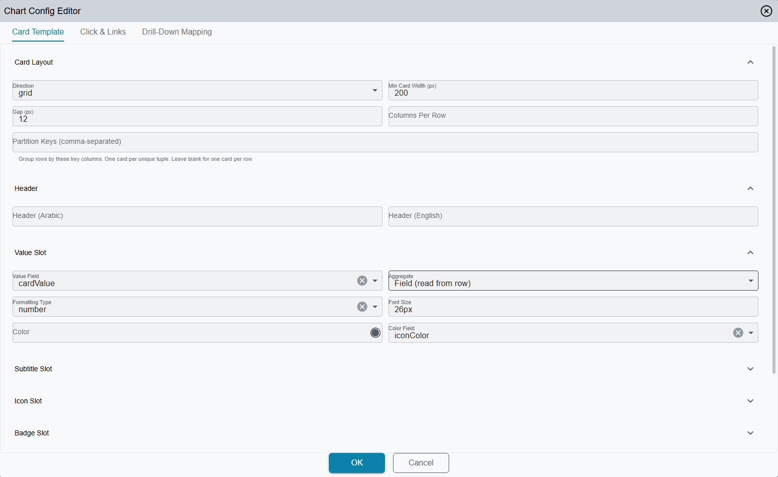
10. Designer
Open the chart-config dialog from the widget's own record with the Edit Chart Config action. The dialog detects type: "EnhancedMetricsCard" and shows a Card Template tab alongside Click & Links and Drill-Down Mapping — there is no Data Mapping tab for this widget type, and no live preview pane either. Card Template has expandable sections: Card Layout, Header, Value Slot, Subtitle, Icon, Badge, Sparkline, plus raw-JSON editors for Card Style and Card Conditional Formatting. Field pickers switch automatically between SQL columns (raw mode) and wizard fields (when wizardDataSource is set).