
Nama ERP BI Module — Technical Reference
This document is the authoritative technical reference for the Nama ERP BI (Business Intelligence) module's JSON structures. It is written primarily for AI assistants and developers who need to create SQL queries, chart configurations, cross-filter bindings, drill-down mappings, and bulk import files that work out-of-the-box when pasted into Nama ERP.
The BI module uses Apache ECharts for chart rendering. AI tools already understand standard ECharts options — this document focuses exclusively on Nama ERP's extensions on top of ECharts: the chartConfigJSON structure, $DATA placeholder system, /*AND-FILTERS*/ SQL injection, cross-filter bindings, drill-down mappings, and the bulk import format.
Schema Discovery
The Nama ERP data model is published at https://dm.namasoft.com. AI tools and developers can use this site to discover entity schemas — table names, column names, data types, join columns, foreign keys, and property paths. This is essential for writing correct SQL queries in widget data sources and for knowing which fieldId paths to use in wizard definitions.
Companion files
Three deep-dive references sit beside this file. Load them on demand to keep context tight:
bi-reference-wizard-mode.md— wizard widgets (wizardDataSource), drill-by, runtime slot selectionbi-reference-enhanced-table.md—EnhancedTablewidget + pivot/cross-tabbi-reference-enhanced-metrics-card.md—EnhancedMetricsCard+ legacyMetricsCards
1. The chartConfigJSON Structure
Every BI widget stores its configuration in a single chartConfigJSON field, held as a JSON string. In the bulk import/export files of Section 10 it appears as a nested JSON object (no escaping). This is the top-level structure:
{
  "echartOption": { },
  "dataMapping": { },
  "clickEmitMapping": [ ],
  "clickAction": { },
  "drillDownMapping": [ ],
  "linkMappings": [ ],
  "disableRuntimeDimensionSelection": false,
  "disableRuntimeMeasureSelection": false
}| Key | Required | Description |
|---|---|---|
echartOption | Yes | A standard ECharts option object with $DATA.* placeholders. The server resolves these placeholders using query results before sending to the frontend. |
dataMapping | Yes | Tells the server how to transform SQL result rows into the $DATA.* values that replace the placeholders. |
clickEmitMapping | No | Defines which cross-filters this widget emits when the user clicks a data point. |
clickAction | No | Widget-level left-click override for charts (and fallback for tables): emit cross-filters, navigate via link, or trigger drill-down. Defaults to cross-filter emission if absent. For tables, prefer per-entry onCellClick on a linkMappings / drillDownMapping entry — see Section 5a. |
drillDownMapping | No | Defines which target widgets or dashboards appear in the right-click drill-down menu, and what filter values to pass to them. |
linkMappings | No | Defines link navigation targets that appear in the right-click context menu under "Navigate To". See Section 5b. |
disableRuntimeDimensionSelection | No (wizard-mode only) | When true, hides the dimension pickers in the widget's runtime slot selector. Defaults to false. See Section 13.9. |
disableRuntimeMeasureSelection | No (wizard-mode only) | When true, hides the measure pickers in the widget's runtime slot selector. Defaults to false. See Section 13.9. |
Non-chart widget types keep their own shape in the same field: EnhancedTable carries columns and tableOptions (Section 14), EnhancedMetricsCard carries its card definitions (Section 15), and TextBlock carries html / htmlEn plus frame styles (Section 9b). None of them use echartOption or dataMapping.
Supported ECharts surface
The client bundles a reduced ECharts build rather than the full library, so echartOption can only use the series types and components that are registered in it. Anything else — a series type or a component that is not in the list below — is silently ignored: the chart renders without it and no error is shown.
Series types (14): bar, line, pie, gauge, heatmap, scatter, funnel, treemap, radar, sankey, sunburst, custom, boxplot, pictorialBar.
Components (17): grid, tooltip, legend, title, toolbox, dataZoom, visualMap, aria, radar (coordinate), markLine, markPoint, markArea, graphic, dataset, dataset.transform, polar, calendar.
Not registered: map / geo, graph, tree, lines, themeRiver, parallel, effectScatter, brush, timeline.
The renderer is Canvas only; there is no SVG renderer. dataset and dataset.transform (filter / sort) are registered, but data shaping should normally be done in the SQL or in dataMapping, which also keeps drill-down and cross-filter point data aligned with what is drawn.
1.1 Wizard Mode vs SQL Mode
A widget operates in one of two modes depending on whether it has a wizardDataSource set:
- SQL mode (
widget.dataSourceis set,widget.wizardDataSourceis null): every column reference inchartConfigJSONis a raw result-set column name (e.g.,"categoryColumn": "branchName"). This is the classic mode and all examples in this document default to it. - Wizard mode (
widget.wizardDataSourceis set): column slots can instead reference wizard field IDs — property paths defined on the wizard (e.g.,"categoryWizardFieldId": "customer.customerCategory"). The backend resolves each field ID to its SQL alias at runtime using metadata cached on the wizard field line, so you don't write column names or repeat the reference sub-columns yourself.
Wizard mode introduces sibling keys next to each existing column key — *WizardFieldId alongside *Column. Both shapes coexist in the same JSON; the backend uses whichever is set, preferring the resolved column. Tempo columns and period-comparison columns (which have no wizard field) continue to use the *Column keys in both modes.
See Section 13 for the full list of wizard-mode key pairs, cross-filter / drill-down interactions, and the dimension drill-by semantics.
2. Data Source Query (SQL)
Each widget has a dataSource field containing a SQL query (T-SQL for SQL Server). The query must include the literal placeholder /*AND-FILTERS*/ in its WHERE clause. The server replaces this with the active cross-filter conditions at runtime. Because the placeholder is a SQL comment, the query is also valid when run directly in SQL Server Management Studio without any modifications.
Reusing complex SQL across widgets
If the same UNION / multi-join / hand-rolled SELECT keeps showing up across several SQL-mode widgets, consider promoting it to a Virtual Entity instead. A Virtual Entity wraps the SELECT in a SQL Server view and registers it as a first-class entity, so it becomes pickable from the wizard's main-table picker (tableType = "VirtualEntity") — and from there, every wizard-mode convenience (auto-joins on reference fields, dimension drill-by, auto-inferred cross-filter columns) works against it as if it were a real table. See the Virtual Entity Guide.
Pattern
SELECT columns
FROM tables
WHERE 1=1 /*AND-FILTERS*/
GROUP BY columns
ORDER BY columns
How /*AND-FILTERS*/ Works
At runtime, the server builds WHERE clause expressions from the widget's cross-filter bindings and replaces /*AND-FILTERS*/ with them:
- If no filters are active:
/*AND-FILTERS*/is removed (empty string), leaving the query unchanged - If filters are active:
/*AND-FILTERS*/becomesAND expr1 AND expr2 AND expr3
Because /*AND-FILTERS*/ is a SQL comment, the query is always syntactically valid — you can paste it directly into SQL Server Management Studio and run it without any edits.
Query Rules
- Always include
/*AND-FILTERS*/— even if the widget has no cross-filter bindings. The server expects it. - Multiple
/*AND-FILTERS*/placeholders are allowed and are all replaced with the same filter expression. Required for CTE-heavy queries: every CTE body that joins a filtered table needs its own placeholder so the filter applies inside it (e.g. aWITH months AS (...), hcSeries AS (SELECT ... FROM Employee WHERE ... /*AND-FILTERS*/), ...must repeat the placeholder in each CTE that touches the filtered table). - The placeholder lives in the WHERE clause only.
HAVING,JOIN ON, and CTE outerSELECTaren't injected into. If you need a filter to apply to aHAVING, mirror the predicate or restructure into a subquery whose WHERE carries the placeholder. - Use table aliases consistently. The
sqlLeftHandSideon a cross-filter targets these aliases (e.g.,l.branch_id). For binding to work, the alias must exist in the query at the placeholder's scope. - For EChart widgets, SQL column names must match the names referenced in
dataMapping(categoryColumn,valueColumn, seriescolumn, etc.). - For Table / EnhancedTable widgets, SQL column names become column
fieldkeys. SELECT TOP Nis recommended for ranked-list widgets. Pair withORDER BY— without it the result-set order is undefined.- To reuse a column for entity-link payloads, alias the entity's
entityTypecolumn explicitly (e.g.SELECT b.id branchId, b.entityType branchEntityType, ...) solinkMappings.linkToEntityTypeColumncan point at it.
Example
SELECT TOP 10
  i.name2 itemName,
  SUM(l.netValue) netValue
FROM SalesInvoiceLine l
  LEFT JOIN InvItem i ON i.id = l.item_id
  LEFT JOIN Branch b ON b.id = l.branch_id
WHERE 1=1 /*AND-FILTERS*/
GROUP BY i.name2
ORDER BY netValue DESC
3. dataMapping — Types and Resolution
The dataMapping object tells the server how to transform query result rows into the data structures that replace $DATA.* placeholders in echartOption.
Scalar pass-through
Any key in dataMapping that isn't a reserved structural field (like type, *Column, series, stack, format, etc.) is automatically exposed as $DATA.<key>. This lets templates carry constants — e.g., "target": 150 in dataMapping becomes $DATA.target in the echartOption, usable inside a markLine definition. Reserved keys: type, categoryColumn, labelColumn, valueColumn, xColumn, yColumn, sizeColumn, innerLabelColumn, outerLabelColumn, leftValueColumn, rightValueColumn, seriesType, stack, areaStyle, percentMode, sort, series, format.
3.1 CategoryValue
The most common type. One column provides category labels (X-axis), and one or more series columns provide numeric values.
Required fields:
type:"CategoryValue"categoryColumn: column name for X-axis categoriesseries: array of series definitions
Series definition:
{
  "column": "netValue",
  "name": "Net Value",
  "type": "bar",
  "format": {"type": "currency", "decimals": 0, "compact": true},
  "yAxisIndex": 0
}| Series field | Required | Description |
|---|---|---|
column | Yes | SQL column name to read numeric values from |
name | No | Display name for legend. Defaults to column name. |
type | No | ECharts series type: "bar", "line", "scatter". Defaults to "bar". |
format | No | Number formatting spec (see Section 7). |
yAxisIndex | No | Which Y-axis this series binds to (for dual-axis charts). Default 0. Propagated onto the built series entry. |
stack | No | Stack group name. Series with the same stack value are stacked. Propagated onto the built series entry. |
areaStyle | No | true or an object — turns the series into a filled area (line charts). Propagated onto the built series entry. |
Produces these $DATA placeholders:
| Placeholder | Type | Description |
|---|---|---|
$DATA.categories | string[] | Distinct values from categoryColumn, in first-seen order — see the warning below |
$DATA.series | object[] | Array of {name, type, data} objects (plus stack / yAxisIndex / areaStyle if set on the series config) |
$DATA.series[0].name | string | Name of first series |
$DATA.series[0].data | number[] | Numeric values of first series |
$DATA.series[N].name | string | Name of Nth series |
$DATA.series[N].data | number[] | Numeric values of Nth series |
$DATA.min | number | Minimum value across all series (useful for visualMap / bar-ranked-style charts) |
$DATA.max | number | Maximum value across all series |
Rows that share a category label are merged
Rows are grouped by the distinct value of categoryColumn, in the order each value is first seen. When several rows carry the same label, their numeric values are summed into a single category, and the drill-down / cross-filter point data for that category is taken from the first row carrying that label. If each row must stay a separate bar, make the label unique in the SQL — for example, append the code or the date to the name.
Example:
{
  "dataMapping": {
    "type": "CategoryValue",
    "categoryColumn": "branchName",
    "series": [
      {"column": "netValue", "name": "Net Value", "type": "bar"},
      {"column": "totalQty", "name": "Quantity", "type": "line", "yAxisIndex": 1}
    ]
  }
}
echartOption using it:
{
  "echartOption": {
    "xAxis": {"type": "category", "data": "$DATA.categories"},
    "yAxis": [{"type": "value"}, {"type": "value"}],
    "series": [
      {"name": "$DATA.series[0].name", "type": "bar", "data": "$DATA.series[0].data"},
      {"name": "$DATA.series[1].name", "type": "line", "data": "$DATA.series[1].data", "yAxisIndex": 1}
    ]
  }
}Shorthand: If the echartOption uses "series": "$DATA.series", the entire series array (with name, type, and data per series) is injected automatically. This is convenient but gives less control over individual series styling.
3.2 CategoryLabelValue
Pivot-table style: one column for categories (X-axis), one column whose distinct values become separate series, and one column for the numeric values. The server automatically pivots the flat result set into grouped series.
Required fields:
type:"CategoryLabelValue"categoryColumn: column for X-axis categorieslabelColumn: column whose distinct values become series namesvalueColumn: column for numeric valuesseriesType: default chart type for all series (e.g.,"bar","line")
Optional fields:
stack: if set (e.g.,"total"), all series get this stack group → stacked chartpercentMode: iftrue, values are normalized to percentages within each category → 100% stacked chartareaStyle: iftrue, series getareaStyle: {}→ stacked area chartformat: number format applied to all series
Produces these $DATA placeholders:
| Placeholder | Type | Description |
|---|---|---|
$DATA.categories | string[] | Distinct values from categoryColumn, in first-seen order |
$DATA.series | object[] | One series per unique label. Each has name, type, data — plus stack / areaStyle when the corresponding top-level dataMapping fields are set. Data arrays are aligned to categories (missing values are 0). Rows that share the same category and label are summed into one point, and its drill-down / cross-filter data comes from the first such row — the same merge rule as Section 3.1. When percentMode is true, values are normalized per category so each category's series sum to 100. |
Example SQL:
SELECT YEAR(l.valueDate) salesYear, b.name2 branchName, SUM(l.netValue) netValue
FROM SalesInvoiceLine l LEFT JOIN Branch b ON b.id = l.branch_id
WHERE 1=1 /*AND-FILTERS*/
GROUP BY YEAR(l.valueDate), b.name2
ORDER BY salesYear
Example config:
{
  "echartOption": {
    "legend": {},
    "xAxis": {"type": "category", "data": "$DATA.categories"},
    "yAxis": {"type": "value"},
    "series": "$DATA.series"
  },
  "dataMapping": {
    "type": "CategoryLabelValue",
    "categoryColumn": "salesYear",
    "labelColumn": "branchName",
    "valueColumn": "netValue",
    "seriesType": "bar",
    "stack": "total"
  }
}
3.3 LabelValue
For pie charts, funnels, and similar: one column for labels, one for values. Each distinct label becomes a data point with {name, value} — rows that share a label are summed into one slice, and its drill-down / cross-filter data comes from the first such row (the merge rule of Section 3.1). If each row must stay a separate slice, make the label unique in the SQL.
Required fields:
type:"LabelValue"labelColumn: column for item namesvalueColumn: column for numeric values
Optional fields:
centerText: text to display in the center of a donut chart (used via$DATA.centerText)format: number format spec
Produces these $DATA placeholders:
| Placeholder | Type | Description |
|---|---|---|
$DATA.values | {name, value}[] | One object per distinct labelColumn value, in first-seen order. value is the sum of valueColumn across the rows sharing that label. |
$DATA.centerText | string | Only if centerText is set in dataMapping. |
Example:
{
  "echartOption": {
    "tooltip": {"trigger": "item", "formatter": "{b}: {c} ({d}%)"},
    "series": [{"type": "pie", "radius": "60%", "data": "$DATA.values"}]
  },
  "dataMapping": {
    "type": "LabelValue",
    "labelColumn": "categoryName",
    "valueColumn": "netValue"
  }
}
3.4 Gauge
For gauge/meter charts. Uses only the first row of the result set.
Required fields:
type:"Gauge"valueColumn: column for the gauge value
Optional fields:
unit: display unit string (e.g.,"%","SAR")max: maximum value for the gauge scalemin: minimum value for the gauge scalebands: color band array (e.g.,[[0.3, "#67e0e3"], [0.7, "#37a2da"], [1, "#fd666d"]])
Produces these $DATA placeholders:
| Placeholder | Type | Description |
|---|---|---|
$DATA.value | number | Numeric value from first row |
$DATA.unit | string | From unit field |
$DATA.max | number | From max field |
$DATA.min | number | From min field |
$DATA.bands | array | From bands field |
3.5 Scatter
For scatter/bubble plots. Each row becomes an [x, y] or [x, y, size] point.
Required fields:
type:"Scatter"xColumn: column for X values (numeric)yColumn: column for Y values (numeric)
Optional fields:
sizeColumn: column for bubble size (numeric)
Produces:
| Placeholder | Type | Description |
|---|---|---|
$DATA.rows | number[][] | Array of [x, y] or [x, y, size] arrays |
3.6 Heatmap
For heatmap/matrix charts. Each row provides an X category, Y category, and numeric value.
Required fields:
type:"Heatmap"xColumn: column for X-axis categoriesyColumn: column for Y-axis categoriesvalueColumn: column for cell values (numeric)
Produces:
| Placeholder | Type | Description |
|---|---|---|
$DATA.xCategories | string[] | Unique X values |
$DATA.yCategories | string[] | Unique Y values |
$DATA.rows | number[][] | Array of [xIndex, yIndex, value] arrays |
$DATA.min | number | Minimum cell value |
$DATA.max | number | Maximum cell value |
3.7 Tree
Generic raw-row context (same as Custom). For treemap charts, prefer LabelValue — it produces the {name, value}[] shape ECharts treemap expects directly.
Required fields:
type:"Tree"
Produces:
| Placeholder | Type | Description |
|---|---|---|
$DATA.rows | string[][] | All rows as string arrays |
$DATA.columns | string[] | Column headers |
3.8 Waterfall
For waterfall (bridge) charts. Given a single value column representing deltas, the server builds two stacked series: an invisible Placeholder that steps the base up/down, and a visible Value bar showing the magnitude of each delta.
Required fields:
type:"Waterfall"categoryColumn: column for X-axis categories (in display order)valueColumn: column for the delta at each category (can be positive or negative)
Produces:
| Placeholder | Type | Description |
|---|---|---|
$DATA.categories | string[] | Unique values from categoryColumn, preserving row order |
$DATA.series | object[] | Two entries: [0] is the invisible placeholder, [1] is the visible value series. Both carry stack: "Total". |
$DATA.series[0].data | number[] | Placeholder heights (the stepped base level per bar) |
$DATA.series[1].data | object[] | [{value: <abs delta>, _signedValue: <raw delta>}, ...]. _signedValue is available for styling (e.g. red for negative). |
3.9 Radar
For radar/spider charts. One column provides indicator names; each series column is a separate metric plotted across indicators.
Required fields:
type:"Radar"categoryColumn: column whose distinct values become the radar indicators (axes)series: array of{column, name}— one entry per entity being compared
Produces:
| Placeholder | Type | Description |
|---|---|---|
$DATA.indicators | {name, max}[] | One per unique category. max is the global maximum across all series (so every axis shares the same scale). |
$DATA.series | {name, value}[] | One per series config. value is an array aligned to $DATA.indicators. |
3.10 GaugeMulti
For concentric multi-ring gauges — each row becomes one ring/gauge item.
Required fields:
type:"GaugeMulti"labelColumn: column for each ring's namevalueColumn: column for each ring's numeric value
Produces:
| Placeholder | Type | Description |
|---|---|---|
$DATA.values | object[] | [{value, name, title: {show: false}, detail: {show: false}}, ...]. Per-point title/detail are pre-hidden to avoid overlapping labels. |
3.11 NestedLabelValue
For nested pies / two-level donuts. Each ring is an independent pie — its own dimension and its own measure — and the two rings are rendered at different radii. Because each ring computes percentages against its own total, the inner and outer measures don't need to share a total (e.g., outer could be "invoice count by customer class", inner "invoice value by branch").
Required fields:
type:"NestedLabelValue"innerLabelColumn: column for inner-ring labelsouterLabelColumn: column for outer-ring labelsinnerValueColumn: measure aggregated for the inner ringouterValueColumn: measure aggregated for the outer ring
Optional fields:
innerSeriesName/outerSeriesName: display names for the two rings (shown in legend / tooltip via ECharts{a}). Templates reference them asname: '$DATA.innerSeriesName'/name: '$DATA.outerSeriesName'.innerFormat/outerFormat: per-ring format spec (number/currency/percent/date/datetime/duration). If unset, the top-levelformatapplies to both. Inner maps to seriesFormat index"0", outer to"1".
Produces:
| Placeholder | Type | Description |
|---|---|---|
$DATA.innerValues | {name, value}[] | Aggregated by innerLabelColumn over innerValueColumn |
$DATA.outerValues | {name, value}[] | Aggregated by outerLabelColumn over outerValueColumn |
$DATA.innerSeriesName | string | Resolved inner ring name (empty string when unset) |
$DATA.outerSeriesName | string | Resolved outer ring name (empty string when unset) |
3.12 FunnelComparison
For side-by-side comparison funnels. One label column with two value columns (left funnel + right funnel).
Required fields:
type:"FunnelComparison"labelColumn: column for stage namesleftValueColumn: column for left-side valuesrightValueColumn: column for right-side values
Produces:
| Placeholder | Type | Description |
|---|---|---|
$DATA.leftValues | {name, value}[] | Aggregated from leftValueColumn |
$DATA.rightValues | {name, value}[] | Aggregated from rightValueColumn |
3.13 Custom / Raw
Custom: Same as Tree — provides$DATA.rowsand$DATA.columns.Raw: No$DATAcontext is built. The echartOption must not contain$DATAplaceholders. Useful for fully static charts.
3.14 Max Results — Top N with Others
For mapping types where a single dimension produces the bucket rows (category, label, outerLabel), dataMapping.maxResults keeps the top N and collapses everything else into a synthetic Others bucket. Common long-tail problem: a bar chart of 20 customers where 4 dominate — the Top N limit keeps the chart readable without hiding the rest of the totals.
| Key | Purpose |
|---|---|
maxResults | Integer. Keep this many buckets; the rest are summed into one "Others" entry. Unset / ≤ 0 = no bucketing |
maxResultsRankBy | Column used to rank buckets (descending). When empty, defaults to series[0].column → valueColumn → leftValueColumn |
maxResultsRankByWizardFieldId | Wizard-mode sibling of maxResultsRankBy |
othersLabelEn / othersLabelAr | Display text for the Others bucket. When empty, falls back to the biOthers translation key |
Supported mapping types: CategoryValue, LabelValue, CategoryLabelValue, Radar, Waterfall, GaugeMulti, FunnelComparison, NestedLabelValue. Not applicable to Scatter, Heatmap, Gauge (no ranking dimension) or Raw, Custom, Tree.
CategoryLabelValue specifics: the Top N is computed across all labels — i.e., the N categories with the highest summed rank-by across every label win; each keeps its per-label breakdown intact.
Interaction behavior: the Others slice emits no cross-filter, drill-down, link, or drill-by — click-emit / drill / link / drill-by payloads for those rows carry {isOthers: true} and the frontend skips all interactions on them. Tooltips are blank over the Others slice.
Chart templates: templates apply a per-category default via chartTemplates.ts → applyDefaultMaxResults(): pie / funnel = 6, radar = 8, bar / treemap = 15. Users can override in the config editor or remove entirely.
"dataMapping": {
  "type": "CategoryValue",
  "categoryColumn": "customerName",
  "series": [{"column": "totalSales", "name": "Total Sales", "type": "bar"}],
  "maxResults": 10,
  "maxResultsRankBy": "totalSales",
  "othersLabelEn": "Other Customers",
  "othersLabelAr": "عملاء آخرون"
}
4. clickEmitMapping — Cross-Filter Emission
When a user clicks a data point on a chart, the widget can emit cross-filter values that filter other widgets on the same dashboard. The clickEmitMapping array defines what values to extract from the clicked point and which cross-filter to set.
"clickEmitMapping": [
  {
    "crossFilterCode": "itemFilter",
    "idColumn": "itemId",
    "codeColumn": "itemCode",
    "name1Column": "itemName1",
    "name2Column": "itemName2",
    "entityType": "InvItem"
  }
]| Field | Required | Description |
|---|---|---|
crossFilterCode | Yes | The code of the BICrossFilter entity to set |
valueColumn | No | Column for scalar values (for non-reference filters like dates, numbers) |
idColumn | No | Column containing the entity ID (binary(16) on SQL Server, converted automatically) |
codeColumn | No | Column containing the entity code |
name1Column | No | Column containing Arabic name |
name2Column | No | Column containing English name |
entityType | No | Static entity type string (e.g., "InvItem", "Customer") |
entityTypeColumn | No | Column containing the entity type (for generic references) |
wizardFieldId | Wizard mode | The wizard field ID this emission is bound to — both as the source of id/code/name sub-columns and as the dimension on which this entry fires. See Section 13. |
Rules:
- For Reference type cross-filters: provide
idColumn(required for the filter to work), pluscodeColumn/name1Column/name2Columnfor display. TheentityTypeis needed for binary(16) ID coercion. - For scalar type cross-filters (Date, Integer, Decimal, Text): provide
valueColumn. - Multiple entries in the array mean the widget emits multiple cross-filters from a single click.
- The columns referenced here must exist in the widget's SQL query.
- In wizard mode, set
wizardFieldIdinstead and omit theidColumn/codeColumn/name1Column/name2Column/entityTypeColumn/entityType/valueColumnfields — the backend resolves them from the wizard field's cached metadata. Entries are also filtered per-dimension: an entry fires only on clicks where itswizardFieldIdis one of the chart's currently-active dimensions.
How it works at runtime:
- User clicks a data point (e.g., bar segment for "Branch A")
- Frontend reads the
_clickEmitDatametadata (injected by the server into the echartOption) - For the clicked point index, it extracts the values from the pre-built point data
- It calls the cross-filter Pinia store to set the filter
- All other widgets bound to this cross-filter re-fetch their data with the new filter applied
5. drillDownMapping — Widget Drill-Down
When a user right-clicks a data point, a context menu shows drill-down targets. Clicking one opens a popup showing the target widget's chart, filtered by values from the clicked point.
"drillDownMapping": [
  {
    "key": "invoiceDetails",
    "targetWidgetCode": "bi-item-invoice-details",
    "arTitle": "عرض تفاصيل الفواتير",
    "enTitle": "View invoice details",
    "orderInMenu": 1,
    "filters": [
      {
        "crossFilterCode": "itemFilter",
        "idColumn": "itemId",
        "codeColumn": "itemCode",
        "name1Column": "itemName1",
        "name2Column": "itemName2",
        "entityType": "InvItem"
      }
    ]
  }
]| Target field | Required | Description |
|---|---|---|
key | No | Unique identifier for this target. Required when referenced by clickAction.targetKey. |
targetType | No | "widget" (default) or "dashboard". Controls whether the target is a single widget or a full dashboard. |
targetWidgetCode | If widget | The code of the DashBoardWidget to open (when targetType is "widget" or omitted) |
targetDashboardCode | If dashboard | The code of the target DashBoard to open (when targetType is "dashboard") |
arTitle | No | Arabic menu item text |
enTitle | No | English menu item text |
openMode | No | How to open the target: "popup" (default — DrillDownDialog), "navigate" (same tab), "newTab". For dashboard targets, popup opens a fullscreen dialog showing all dashboard widgets. |
orderInMenu | No | Sort order in the context menu (ascending) |
column | Table widgets only | Scopes the entry to a specific column. Absent = row-level (right-click any cell). |
onCellClick | No | Table widgets only. When true, left-clicking a cell that matches this entry's scope (its column, or any cell if row-level) fires the drill-down directly — no right-click needed. See Section 5a. |
filters | Yes | Array of filter definitions (same structure as clickEmitMapping entries) |
wizardFieldId | Wizard mode | The dimension this drill target belongs to. The menu only shows entries whose wizardFieldId matches one of the chart's active dimensions. See Section 13. |
Each filter entry has the same fields as clickEmitMapping (crossFilterCode, idColumn, codeColumn, name1Column, name2Column, entityType, entityTypeColumn, valueColumn). In wizard mode each filter may carry wizardFieldId instead of the column fields — the backend fills in the sub-columns from the wizard field's cached metadata.
How it works:
- User right-clicks a data point
- Context menu shows drill-down targets sorted by
orderInMenu - User selects a target
- Frontend builds
drillDownFiltersfrom the clicked point values using the filter column mappings - Server receives the request, applies the drill-down filters as additional WHERE clauses on the target widget's query
- The target widget's chart renders in a popup dialog
Multiple drill-down targets can be defined for the same widget — the context menu shows all of them.
Dashboard Drill-Down
So far we have seen drill-down targets that open a single widget. But what if you want to drill into an entire dashboard — say, a "Regional Analysis" dashboard with its own set of charts? That is what targetType: "dashboard" is for.
When targetType is "dashboard", you provide targetDashboardCode instead of targetWidgetCode. The drill-down filters are passed to all widgets on the target dashboard, just as if the user had set those cross-filters manually.
"drillDownMapping": [
  {
    "key": "salesDetail",
    "targetType": "widget",
    "targetWidgetCode": "SALES_DETAIL",
    "enTitle": "Sales Details",
    "arTitle": "تفاصيل المبيعات",
    "orderInMenu": 1,
    "filters": [...]
  },
  {
    "key": "regionalDash",
    "targetType": "dashboard",
    "targetDashboardCode": "REGIONAL",
    "enTitle": "Regional Dashboard",
    "arTitle": "لوحة المنطقة",
    "openMode": "popup",
    "orderInMenu": 2,
    "filters": [...]
  }
]
The openMode field controls how the target opens:
openMode | Behavior |
|---|---|
"popup" | Default. Opens a DrillDownDialog. For dashboard targets, this is a fullscreen dialog that renders all the dashboard's widgets. |
"navigate" | Navigates in the same browser tab. |
"newTab" | Opens the target in a new browser tab. |
TIP
Dashboard drill-down is particularly useful for hierarchical analysis — for example, drilling from a company-wide summary into a regional dashboard, and from there into a branch-level dashboard. Each level passes its filters down to the next.
5a. Controlling Left-Click Behavior
By default, clicking a data point on a chart (or a cell in a table) emits cross-filters (the values defined in clickEmitMapping). Two mechanisms let you override that: the per-entry onCellClick flag on links and drill-downs (tables), and the widget-level clickAction (charts without columns).
5a.1 onCellClick — Per-Entry Left-Click (Tables + EnhancedTable)
The recommended way for Table/EnhancedTable widgets: mark a specific linkMappings or drillDownMapping entry with "onCellClick": true. When a cell is clicked, the dispatcher looks for the first entry whose scope matches the clicked cell and fires it.
"linkMappings": [
  {
    "key": "openCustomer",
    "column": "customerName",
    "onCellClick": true,
    "linkToEntityTypeColumn": "customerEntityType",
    "linkToIdColumn": "customerId",
    "openMode": "popup"
  }
]
Match rules for onCellClick: true entries:
| Entry scope | Matches |
|---|---|
column set (e.g. "customerName") | Only when the clicked cell is in that column |
column absent (row-level) | Any cell in the row |
Priority order inside one widget — the dispatcher walks the list in this order and fires the first match:
- Drill-down entries with
onCellClick: true(drill-down wins over link when both match). - Link entries with
onCellClick: true. - Widget-level
clickAction(see below). - Cross-filter emission (
clickEmitMapping).
Entries without onCellClick still appear in the right-click context menu — the flag only controls left-click auto-fire.
5a.2 Widget-Level clickAction (Charts + Fallback)
For ECharts widgets there's no per-cell concept — a click hits a data point, not a column. The widget-level clickAction object defines a single action for the whole widget:
"clickAction": {
  "type": "crossFilter | link | drillDown",
  "targetKey": "someKey"
}| Field | Required | Description |
|---|---|---|
type | Yes | One of "crossFilter", "link", or "drillDown". |
targetKey | If link or drillDown | The key of the target in linkMappings (for "link") or drillDownMapping (for "drillDown"). Not used for "crossFilter". |
The three modes:
"crossFilter"— The current default behavior. The widget emits cross-filter values fromclickEmitMapping. This is what happens whenclickActionis absent entirely, so you only need to specify it explicitly if you want to be self-documenting."link"— Navigates using a link defined inlinkMappings. ThetargetKeymust match thekeyof one of the link entries."drillDown"— Triggers drill-down to a target defined indrillDownMapping. ThetargetKeymust match thekeyof one of the drill-down entries. This is handy when you want a single-click drill-down experience without requiring the user to right-click and choose from a menu.
For Table/EnhancedTable widgets, clickAction is still honored but only as a fallback — onCellClick entries are checked first. The resolved target's column scope is also respected: if clickAction.targetKey points to a link/drill entry with column: "X", the action fires only when the clicked cell is in column X. Prefer onCellClick for tables so the target scope lives on the mapping itself, not duplicated as a targetKey pointer.
WARNING
If neither onCellClick nor clickAction is set, the widget falls back to cross-filter emission — exactly the same behavior as before these features were introduced. Existing configurations do not need any changes.
Example — left-click opens a drill-down widget directly:
{
  "clickAction": {
    "type": "drillDown",
    "targetKey": "invoiceDetails"
  },
  "drillDownMapping": [
    {
      "key": "invoiceDetails",
      "targetWidgetCode": "bi-item-invoice-details",
      "enTitle": "Invoice Details",
      "arTitle": "تفاصيل الفواتير",
      "filters": [...]
    }
  ]
}
In this configuration, left-clicking a data point immediately opens the "Invoice Details" drill-down popup. The right-click context menu still shows all drill-down targets as usual.
Which parts of a chart respond to a click
Not every pixel of a chart is a data point. The click handling above fires only where the chart reports a hit on an actual item, so a few regions look clickable but are not:
- A bar's
showBackgroundtrack (the faint full-height band behind the bar) is not clickable — only the bar itself is. - Items drawn with
opacity: 0are not hit-tested; a fully transparent item cannot be clicked. - A gauge responds only on its progress arc and pointer, not on the axis track behind them.
- In a combo chart, an
areaStylefill on a line series sits on top of the bars. A click on the shaded fill is resolved by the nearest category on the x-axis, so the bar under the fill still receives the click. If you want the line to be fully transparent to clicks instead, set"silent": trueon that series (see the note under Line Chart with Area Fill). - On a treemap, the clicked node is resolved by its name, not by its position.
5b. linkMappings — Link Navigation
The linkMappings array defines navigation links that appear in the right-click context menu under a "Navigate To" group. These links let users jump from a chart data point to an entity edit screen, an external URL, or any internal route.
"linkMappings": [
  {
    "key": "openCustomer",
    "enLabel": "Open Customer",
    "arLabel": "فتح العميل",
    "linkToEntityTypeColumn": "CustomerEntityType",
    "linkToIdColumn": "CustomerId",
    "openMode": "popup",
    "labelColumn": "CustomerName"
  },
  {
    "key": "openWebsite",
    "enLabel": "Open Website",
    "arLabel": "فتح الموقع",
    "linkColumn": "WebsiteURL"
  }
]
There are two kinds of links, distinguished by which fields you provide:
Direct Link (URL-based)
Use the linkColumn field to point to a SQL column that contains a URL. The system inspects the URL to decide how to open it:
- Absolute URLs (starting with
http://orhttps://) open in a new browser tab. - Relative URLs are treated as internal application routes and navigate within the app.
| Field | Required | Description |
|---|---|---|
key | Yes | Unique identifier for the link. Referenced by clickAction.targetKey. |
enLabel | No | English label in the context menu |
arLabel | No | Arabic label in the context menu |
linkColumn | Yes | SQL column containing the URL |
column | Table widgets only | Scopes the entry to a specific column (absent = row-level, any cell). |
onCellClick | No | Table widgets only. When true, left-clicking a matching cell fires this link without needing the right-click menu. See Section 5a.1. |
Entity Navigation Link
Use linkToEntityTypeColumn + linkToIdColumn to build a link that opens an entity's edit view — for example, opening the Customer record that a chart bar represents.
| Field | Required | Description |
|---|---|---|
key | Yes | Unique identifier for the link. Referenced by clickAction.targetKey. |
enLabel | No | English label in the context menu |
arLabel | No | Arabic label in the context menu |
linkToEntityTypeColumn | Yes | SQL column containing the entity type string (e.g., "Customer") |
linkToIdColumn | Yes | SQL column containing the entity ID |
entityType | No | Static entity type string. Use this instead of linkToEntityTypeColumn when every row links to the same entity type. |
openMode | No | How to open the entity: "popup" (Quasar dialog, default), "navigate" (same tab), "newTab". |
labelColumn | No | SQL column used to enrich the context menu label. For example, if enLabel is "Open Customer" and labelColumn resolves to "ABC Trading", the menu shows "Open Customer 'ABC Trading'". |
column | Table widgets only | Scopes the entry to a specific column (absent = row-level, any cell). |
onCellClick | No | Table widgets only. When true, left-clicking a matching cell opens the link without needing the right-click menu. See Section 5a.1. |
TIP
The labelColumn field is a small touch that makes a big difference in usability. Instead of a generic "Open Customer" menu item, the user sees "Open Customer 'ABC Trading'" — they know exactly where the link will take them before they click.
Example — chart widget, left-click navigates to a customer entity (widget-level clickAction):
{
  "clickAction": {
    "type": "link",
    "targetKey": "openCustomer"
  },
  "linkMappings": [
    {
      "key": "openCustomer",
      "enLabel": "Open Customer",
      "arLabel": "فتح العميل",
      "linkToEntityTypeColumn": "CustomerEntityType",
      "linkToIdColumn": "CustomerId",
      "openMode": "popup",
      "labelColumn": "CustomerName"
    }
  ]
}
Here, left-clicking any data point on the chart opens the customer's edit form. The same link also appears in the right-click context menu under "Navigate To".
Example — EnhancedTable, click the customer-name cell to open its record (per-entry onCellClick):
{
  "columns": [
    {"id": "code", "field": "code"},
    {"id": "customerName", "field": "customerName"}
  ],
  "linkMappings": [
    {
      "key": "openCustomer",
      "column": "customerName",
      "onCellClick": true,
      "enLabel": "Open Customer",
      "arLabel": "فتح العميل",
      "linkToEntityTypeColumn": "CustomerEntityType",
      "linkToIdColumn": "CustomerId",
      "openMode": "popup",
      "labelColumn": "CustomerName"
    }
  ]
}
Clicking the customer-name cell opens the entity; clicking any other cell falls through to cross-filter emission. No clickAction needed — the link's own column + onCellClick flag carry all the information.
6. Cross-Filter Bindings
Cross-filter bindings define which cross-filters a widget responds to (not emits — that's clickEmitMapping). They live in two places, with different shapes:
Widget-level (DashBoardWidget.crossFilterBindings) — the common form
"crossFilterBindings": [
  {"crossFilter": "branchFilter"},
  {"crossFilter": "dateFrom"},
  {"crossFilter": "dateTo"}
]
Each entry references a BICrossFilter by code. When the filter has a value, the server injects a WHERE clause into the widget's SQL using the filter's sqlLeftHandSide and operator. Optional fields per entry: sqlLeftHandSide (override), operator (override), customWhereClause, localScope.
Dashboard-level (DashBoard.crossFilterBindings) — overrides only, element required
"crossFilterBindings": [
  {"element": "ex-top-items", "crossFilter": "branchFilter", "operator": "In"}
]
Dashboard-level entries carry an extra required element field naming the target widget (DashBoardWidget.code). They exist solely to override a single binding for one specific widget on this dashboard — typical use is changing the operator or sqlLeftHandSide for that widget without touching its widget-level binding.
Don't use dashboard-level bindings as a substitute for widget-level ones. A bare {"crossFilter": "X"} at dashboard scope is malformed — it'll fail validation because element is required. If every widget on the dashboard needs the same binding, declare it at the widget level on each widget. Most dashboards have crossFilterBindings: [] at the dashboard root.
Example flow:
BICrossFilterwith code"branchFilter"hassqlLeftHandSide: "l.branch_id"andoperator: "Equal"- Widget X has
crossFilterBindings: [{"crossFilter": "branchFilter"}] - User clicks a branch on another widget, setting the
branchFiltercross-filter - Widget X re-fetches data; the server replaces
/*AND-FILTERS*/withAND l.branch_id = <selected branch ID>
Supported Operators
| Operator | SQL | Use case |
|---|---|---|
Equal | = | Exact match (default) |
In | IN (...) | Multi-value selection |
GreaterThanOrEqual | >= | Date from, minimum value |
LessThanOrEqual | <= | Date to, maximum value |
GreaterThan | > | Strict greater than |
LessThan | < | Strict less than |
NotEqual | <> | Exclusion |
Contains | LIKE '%value%' | Text search |
StartsWith | LIKE 'value%' | Text prefix match |
Widget-Local Scope (localScope)
Cross-filter bindings — both at the widget level (DashBoardWidget.crossFilterBindings) and at the dashboard level (DashBoard.crossFilterBindings) — carry an optional localScope flag:
"crossFilterBindings": [
  {"crossFilter": "regionFilter", "localScope": true},
  {"crossFilter": "dateFrom"}
]
When localScope is true for a binding, that filter belongs to the widget's own filter popup instead of the dashboard's global filter bar. Specifically:
- The widget exposes a filter button on its header. Clicking it opens a popup with one input per
localScopebinding. Values entered there apply only to this widget. - Click-emitted cross-filters from other charts, and values typed into the dashboard filter bar, are ignored for
localScopebindings — only the widget's own popup can drive them. - If every binding for a given cross-filter code (across all widgets and the dashboard) is
localScope, that code disappears from the dashboard filter bar entirely. - A drill-down request that targets a
localScope-bound code still passes its value through (drill-down takes precedence over local scope, since it is an explicit user action). - Period-comparison shifting still applies — the resolved local value flows through
BIPeriodComparisonExecutorlike any other. - The widget's local filter values are serialized into the shareable dashboard URL via
localToChart, so a copied URL restores the same per-widget filter state.
Use localScope when one chart needs an independent slicer (e.g. "show this KPI for Region X") that should not propagate to its sibling widgets.
7. Number Format Spec
Two formatter shapes exist — pick by widget family:
| Where it's used | Shape | Field for currency symbol |
|---|---|---|
ECharts dataMapping.series[].format (Section 3) | format object below | currency |
EnhancedTable column / EnhancedMetricsCard slot formatting (Section 14.4.1, 15.2) | Richer formatting object | currencySymbol (also currencyCode, currencyPlacement) |
Legacy MetricsCards metricsCardConfig.numberFormat | numeral.js mask string (e.g. "0,0", "0,0.00") plus separate suffix | n/a |
The two are not interchangeable — putting currency: "SAR" on an EnhancedTable column does nothing; putting currencySymbol: "SAR" in an ECharts series format does nothing.
ECharts series format (dataMapping.series[].format)
"format": {
  "type": "currency",
  "decimals": 0,
  "compact": true,
  "currency": "SAR"
}| Field | Values | Description |
|---|---|---|
type | "number", "currency", "percent", "compact" | Formatting mode |
decimals | 0, 1, 2, ... | Decimal places |
compact | true / false | Use compact notation (1K, 1M, 1B) |
currency | "SAR", "USD", etc. | Currency symbol. If omitted and type is "currency", the system's default currency is used. |
8. BICrossFilter Entity
Cross-filters are master-file entities that define reusable filter parameters. They produce QuestionField metadata for rendering filter UI controls, and carry default SQL bindings.
{
  "code": "branchFilter",
  "name1": "فلتر الفرع",
  "name2": "Branch Filter",
  "paramType": "Reference",
  "referencedEntityType": "Branch",
  "listParam": true,
  "listDisplayType": "Chips",
  "arTitle": "الفرع",
  "enTitle": "Branch",
  "sqlLeftHandSide": "l.branch_id",
  "operator": "In"
}| Field | Required | Description |
|---|---|---|
code | Yes | Unique identifier, referenced by widgets |
name1 / name2 | Yes | Arabic / English name |
paramType | Yes | Base scalar type. Allowed values: "Text", "Integer", "Long", "Decimal", "Boolean", "Date", "Time", "Reference", "Genericreference", "BigText", "Enum", "ID", "EntityType", "Password", "LatLng". (There is no "ListParam" value — multi-value mode is the orthogonal listParam flag below.) |
listParam | No | When true, the filter accepts multiple values. Required when operator is "In" or "NotIn". Pair with listDisplayType to control the UI affordance. |
listDisplayType | No | UI affordance for listParam: true filters: "Default", "Dropdown", or "Chips" (the chip strip is the most common). Chips shows a search box and a "show more" control whenever the list has more than one page of options (page size 25), so long lists remain pickable; Dropdown remains the compact choice for very long lists. |
referencedEntityType | If paramType=Reference | Entity type (e.g., "Branch", "Customer", "InvItem") |
arTitle / enTitle | No | Localized labels shown in the filter bar. |
sqlLeftHandSide | Yes | SQL expression on the left of the WHERE condition (e.g., "l.branch_id"). For Reference filters, point at the ID column — never a name/code column; binary(16) encoding is handled automatically. |
operator | Yes | Comparison operator (see §6). "In"/"NotIn" require listParam: true. |
customWhereClause | No | Full custom WHERE fragment (overrides sqlLeftHandSide + operator). |
required | No | Filter must have a value before any widget query runs. |
defaultValue | No | Initial value applied when the dashboard loads. |
allowedValues | No | Long-text whitelist of accepted literal values (validation only). |
hidden | No | Hide from the filter bar (still appliable via URL or click-emit). |
requiredGroup | No | Multi-filter "at least one of" group code — any filter in the group satisfies the requirement. |
criteriaExpression | No | Server-side criteria for the filter's reference picker (Reference filters). Same syntax as a report parameter's filter, ${otherFilterCode} substitution included — see Narrowing what the user may choose. |
suggestionQuery | No | Custom SQL that returns suggestion rows for autocomplete pickers. |
comparisonConfig | No | Period-comparison config (offset, baseline label) — see BIPeriodComparisonExecutor. |
showAsDateRange | No | Render the filter as a single from/to range picker that expands to two bound parameters — see Section 8a. |
autoCreateWidget | No | When true, saving the cross-filter also creates a paired CrossFilterControl widget with the same code/name1/name2 and crossFilterRef set. |
hideFilterTitle | No | Suppress the title label across all renderings (popup, bar dialog, CrossFilterControl legend). |
Operator/listParam contract — these combinations matter:
operator | listParam | Behavior |
|---|---|---|
Equal / NotEqual / > / >= / < / <= / Contains / StartsWith | false (or omitted) | Single value. |
In / NotIn | true (required) | Multi-value; emits IN (...) / NOT IN (...). Setting In without listParam: true is a configuration error. |
8a. Date-Range Cross-Filters (showAsDateRange)
showAsDateRange: true turns one cross-filter record into a from/to pair. There is still exactly one BICrossFilter; the server derives two bound parameters from it.
{
  "code": "docDate",
  "name1": "تاريخ المستند",
  "name2": "Document Date",
  "paramType": "Date",
  "showAsDateRange": true,
  "arTitle": "الفترة",
  "enTitle": "Period",
  "sqlLeftHandSide": "h.value_date"
}
Derived parameter names — the filter's code with its first letter upper-cased, prefixed From and To:
code | From parameter | To parameter |
|---|---|---|
docDate | FromDocDate | ToDocDate |
The filter's own code is never bound as a parameter for a date-range filter — only the derived pair is.
Generated WHERE fragments — for every widget bound to the filter:
h.value_date >= :FromDocDate
h.value_date <= :ToDocDate
Each fragment is emitted only when its end of the range has a value, so a half-open range yields a single condition. The operator on the filter and on the binding is ignored — the pair is fixed to >= / <=. A customWhereClause (on the filter or on the binding) still wins: it replaces the whole pair with your SQL.
Stored value format — the picker stores one string, in one of two forms:
| Form | Example | Meaning |
|---|---|---|
| Preset key | ThisMonth | Re-resolved against today on every fetch |
| Explicit range | 2026-01-01@2026-03-31 | Literal yyyy-MM-dd dates joined by @ |
Preset keys: Today, Yesterday, ThisWeek, PreviousWeek, ThisMonth, PreviousMonth, ThisQuarter, PreviousQuarter, ThisYear, PreviousYear, Last7, Last30, Last90, Last365. Weeks run Sunday→Saturday; Last7 is today plus the six days before it. defaultValue accepts either form.
Because a preset stores the period rather than the dates, a dashboard saved with ThisMonth follows the calendar instead of freezing on the month it was authored in.
How the value is displayed — filter chips, filter badges and the drill-down popup show an explicit range as "from – to" (both dates), and a half-open range shows only the bound that is set.
Binding notes:
listParam/listDisplayTypedo not apply — a range is a single value, never a multi-select.paramTypeisDate, but the value that travels between the UI and the server is the range string above, not a date.- A
localScopebinding behaves as it does for any other filter: the pair moves into the widget's own filter popup. comparisonConfigis set on the single record: for a previous-period run both derived parameters are shifted by the config's subtracted period.
9. Widget Types
| Type | Rendering | chartConfigJSON needed? |
|---|---|---|
EChart | ECharts chart (uses echartOption + dataMapping) | Yes |
Table | AG Grid table (columns from SQL, rows from data) | No |
EnhancedTable | AG Grid table driven entirely by chartConfigJSON.columns — per-column formatting, renderers, conditional formatting, column groups, pinning, aggregation. See Section 14. | Yes |
CrossFilterControl | Slicer-style filter widget — renders one BICrossFilter as an editor on the dashboard grid. Requires only crossFilterRef. See Section 9a. | No |
TextBlock | Non-data rich-HTML widget. Main usage: section headers and titles between data widgets. Also: subtitles, descriptions, instructions. See Section 9b. | Yes |
EnhancedMetricsCard | JSON-driven KPI card strip — cards, slots, sparklines, conditional colouring. See Section 15. | Yes |
MetricsCards | Legacy KPI cards driven by metricsCardConfig fields on the widget record, not by chartConfigJSON. | No |
PieChart, ColumnWithRotatedLabels, etc. | Legacy Highcharts types (auto-translated to ECharts server-side) | No |
For Table widgets, the SQL column names become the grid column headers. No chartConfigJSON is needed — just provide the dataSource SQL and crossFilterBindings.
For EnhancedTable widgets, every column is declared explicitly in chartConfigJSON with its own formatting spec, cell renderer, and conditional-formatting rules. See Section 14 for the full schema.
For CrossFilterControl widgets, no dataSource, no chartConfigJSON, no crossFilterBindings. Only crossFilterRef is required.
9a. CrossFilterControl Widget
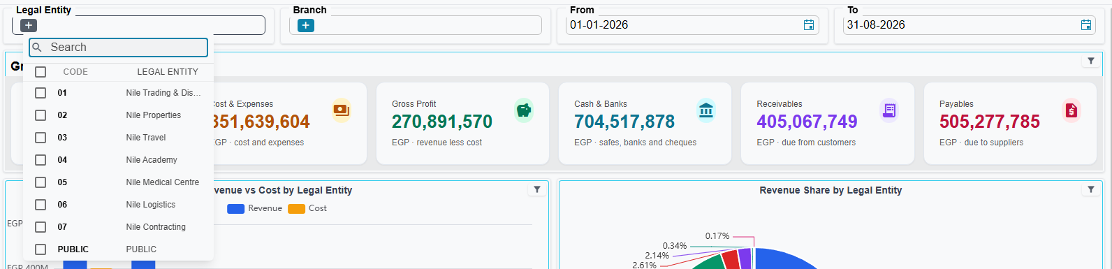
Renders one BICrossFilter as a slicer on the dashboard grid. The same cross-filter may be placed in more than one widget; multiple CrossFilterControl widgets per dashboard are allowed.
{
  "code": "branchFilter",
  "name1": "فلتر الفرع",
  "name2": "Branch Filter",
  "type": "CrossFilterControl",
  "crossFilterRef": "branchFilter"
}
The fastest way to author one is to set autoCreateWidget: true on the BICrossFilter (Section 8) — saving the cross-filter creates the paired widget. Otherwise create the widget manually with the JSON above.
When the dashboard has a CrossFilterControl for a code, that filter is hidden from the global-bar edit dialog; an active value still appears as a chip in the bar.
9b. TextBlock Widget
Non-data rich-HTML widget. Main usage: section headers separating groups of data widgets on a dashboard. Also subtitles, descriptions, instructions.
No dataSource, no crossFilterBindings, no wizardDataSource. The widget is a static renderer; chartConfigJSON carries the content + frame styles.
{
  "code": "salesHeader",
  "name1": "ترويسة المبيعات",
  "name2": "Sales Header",
  "type": "TextBlock",
  "chartConfigJSON": {
    "html": "<h2>أداء المبيعات</h2>",
    "htmlEn": "<h2>Sales Performance</h2>",
    "bgColor": "#f5f5f5",
    "padding": "8px",
    "textAlign": "center"
  }
}
chartConfigJSON keys (all optional, but at least one of html / htmlEn is needed for the widget to show anything):
| Key | Effect |
|---|---|
html | Arabic content. Rendered as HTML. Authored in the designer's Arabic Text tab (rich-text editor or raw-HTML box). |
htmlEn | English content. Same authoring, English Text tab. |
bgColor | Wrapper background-color. |
color | Wrapper color (default text color). |
padding | CSS shorthand (e.g. 8px or 8px 12px). |
fontSize | Wrapper font-size. |
borderColor, borderWidth, borderRadius | Wrapper border. |
textAlign | left / center / right / justify. |
The two content keys are independent of the frame styles, which apply to both languages. Each language falls back to the other when its own key is empty or missing: an Arabic UI renders html, or htmlEn if html is empty; an English UI renders htmlEn, or html if htmlEn is empty. A widget authored before htmlEn existed therefore keeps rendering its single html block in both languages.
10. Bulk Import JSON Format
Nama ERP supports importing a complete dashboard setup (cross-filters, widgets, wizards, and dashboard layout) from a single JSON file. This is the fastest way to create a full dashboard with multiple interconnected charts.
Sample file
A working end-to-end example is available: HR_DASHBOARD_IMPORT.json. Download it and import via the bulk-import flow described in How to Import to see cross-filters, widgets, wizards, and the dashboard layout wired together.
Top-Level Structure
{
  "BICrossFilter": [ ],
  "DashBoardWidget": [ ],
  "DashBoardWidgetWizard": [ ],
  "DashBoard": [ ]
}
All four keys are optional — include only the entity types you need. Entities are created in order: cross-filters first, then widgets, then wizards, then dashboards. References between entities use code (business key), not IDs.
11.1 BICrossFilter Array
Each entry creates a BICrossFilter master file entity. See Section 8 for field definitions.
{
  "code": "branchFilter",
  "name1": "فلتر الفرع",
  "name2": "Branch Filter",
  "paramType": "Reference",
  "referencedEntityType": "Branch",
  "arTitle": "الفرع",
  "enTitle": "Branch",
  "sqlLeftHandSide": "l.branch_id",
  "operator": "Equal"
}
11.2 DashBoardWidget Array
Each entry creates a DashBoardWidget entity. Key fields:
{
  "code": "bi-sales-by-item",
  "name1": "المبيعات حسب الصنف",
  "name2": "Sales by Item",
  "chartTitle": "المبيعات حسب الصنف",
  "englishChartTitle": "Sales by Item",
  "type": "EChart",
  "dataSource": "SELECT ... WHERE 1=1 /*AND-FILTERS*/ ...",
  "chartConfigJSON": { },
  "horizontalMode": true,
  "crossFilterBindings": [
    {"crossFilter": "branchFilter"},
    {"crossFilter": "dateFrom"}
  ]
}| Field | Required | Description |
|---|---|---|
code | Yes | Unique widget code |
name1 / name2 | Yes | Arabic / English name |
chartTitle / englishChartTitle | No | Localized title shown above the chart. Emoji prefixes are fine. |
type | Yes | One of: "EChart", "Table", "EnhancedTable", "EnhancedMetricsCard", "MetricsCards" (legacy), "CrossFilterControl", "TextBlock", "PieChart", "ColumnWithRotatedLabels", "ColumnWithCategsAndLabels", "CombinationChart", "BasicAreaChart", "Gauge", "HeatMap", "HTML", "ThreeDPieChart", "ColumnRange", "Calendar", "ResourceView", "Report", "StackedAndGroupedColumn", "CardMenu", "Timeline", "RecentVisits". See §9 for which need chartConfigJSON. |
dataSource | Most types | SQL query with /*AND-FILTERS*/ placeholder. Skipped for CrossFilterControl, TextBlock. |
chartConfigJSON | If EChart / EnhancedTable / EnhancedMetricsCard / TextBlock | A nested JSON object, written inline — no escaping. The importer serializes it to the stored string for you. Legacy escaped-string values are still accepted. |
wizardDataSource | No | Code of a DashBoardWidgetWizard entity (alternative to raw SQL). See §13. |
horizontalMode | No | Layout hint. On CrossFilterControl widgets, true = inline chip strip, false = stacked editor. |
crossFilterBindings | No | Array of {"crossFilter": "filterCode"} (widget-level — see §6). |
metricsCardConfig | If type=MetricsCards | Top-level value object (not inside chartConfigJSON) carrying the legacy card template — see §15.1 for the shape. |
crossFilterRef | If type=CrossFilterControl | Bare string — the BICrossFilter code (e.g. "branchFilter"). Do not use an object ({"code": "..."}) — the importer rejects it with "crossFilterRef cannot be empty". See §9a. |
enableComparison | No | Toggles period-comparison execution (BIPeriodComparisonExecutor). |
mergeComparisonByColumns | No | CSV of column names that key the merge between baseline and comparison rows. |
INFO
Write chartConfigJSON as a nested JSON object in import/export files — no escaping, no manual stringification. The system serializes it to the stored JSON string on import and parses it back to an object on export. Older files that still carry chartConfigJSON as an escaped string keep importing unchanged.
This nested-object convenience belongs to the import/export file format only. Creating a widget through the generic record-import path (a record JSON handed straight to the entity service) does not get it: there, chartConfigJSON has to be a stringified JSON string, and a nested object is read as a reference rather than as configuration.
11.3 DashBoardWidgetWizard Array (Optional)
Wizards define data sources using field IDs rather than raw SQL. The system generates SQL from the wizard definition and enables several features (dimension drill-by, auto-inferred cross-filter columns, per-dimension drill menus) that raw-SQL widgets don't get. See Section 13 for the wizard-mode chart-config shape.
{
  "code": "bi-sales-breakdown",
  "name1": "bi-sales-breakdown",
  "name2": "bi-sales-breakdown",
  "type": "EChartDataSource",
  "tableType": "DetailLine",
  "mainTable": "SalesInvoiceLine",
  "fields": [
    {"fieldId": "customer.customerCategory", "chartUsageType": "Dimension"},
    {"fieldId": "genericDimensions.branch", "chartUsageType": "Dimension"},
    {"fieldId": "price.netValue", "sqlAggregationType": "Sum", "chartUsageType": "Measure"}
  ]
}| Field | Required | Description |
|---|---|---|
code | Yes | Unique wizard code (referenced by widget's wizardDataSource) |
type | Yes | Always "EChartDataSource" |
tableType | Yes | "Entity", "DetailLine", "SystemTable", or "VirtualEntity" |
mainTable | Yes | Database table/entity type name |
fields[].fieldId | Yes | Property path (e.g., "customer.customerCategory", "price.netValue") |
fields[].chartUsageType | Yes | "Dimension" or "Measure" |
fields[].sqlAggregationType | If Measure | "Sum", "Count", "DistinctCount", "Avg", "Min", "Max" |
11.4 DashBoard Array
Each entry creates a DashBoard entity. There are two kinds: Single (a grid of widgets) and Tabbed (a parent that composes other Single dashboards as tabs).
Single dashboard (grid of widgets)
{
  "code": "bi-sales-dashboard",
  "name1": "لوحة تحليل المبيعات",
  "name2": "Sales Analysis Dashboard",
  "kind": "Single",
  "rowsCount": 3,
  "colsCount": 3,
  "charts": [
    { "element": "bi-sales-by-item",   "rowNumber": 1, "columnNumber": 1, "heightInRows": 1, "widthInColumns": 2 },
    { "element": "bi-monthly-trend",   "rowNumber": 2, "columnNumber": 1, "heightInRows": 2, "widthInColumns": 3 }
  ],
  "crossFilterBindings": []
}
The furthest widget here ends on row 3 of 3, so this dashboard fits exactly one screen and never scrolls — the trend chart gets two thirds of the height and the top widget one third. That is the right shape for a summary board and the wrong shape for anything with a table on it; the next section explains why.
Sizing and scrolling
rowsCount is not a count of fixed-height cells. It is a divisor. The dashboard takes whatever height it has on screen and divides it by rowsCount, so one row is available height ÷ rowsCount and a widget is heightInRows ÷ rowsCount of the screen. There is no pixel value for "a row" anywhere in the system. A row number only means something relative to the rowsCount of the same dashboard: heightInRows: 6 is half the screen when rowsCount is 12, and one eighth of it when rowsCount is 48.
The consequence authors keep getting wrong: raising rowsCount makes everything smaller, not bigger. To make a widget taller you raise that widget's own heightInRows. rowsCount is only the scale you measure it against.
"Available height" is the dashboard's scrolling area — the browser window minus the application toolbar and minus the filter/tab bar above the widgets. Each widget also carries a few pixels of padding inside its slot, so the widget itself is marginally shorter than its share.
When a dashboard scrolls
The dashboard renders as many rows as the furthest widget needs, even when that is more than rowsCount:
extent      = max over widgets of (rowNumber + heightInRows - 1)
rows drawn  = max(rowsCount, extent)
Rows are then handed out one screenful at a time: each group of rowsCount rows gets exactly one screen of height. So:
extent <= rowsCount→ everything is compressed into a single screen and the dashboard never scrolls, however many widgets it holds.extent > rowsCount→ the dashboard isextent ÷ rowsCountscreens tall and scrolls vertically.
The equal-extent trap
Sizing a dashboard so the last widget ends exactly on the last row — extent == rowsCount — guarantees it will never scroll. Everything is then squeezed into one screen, and tall content suffers first: a table given a small share of a single screen renders as a header strip with no visible data rows. If you find yourself raising rowsCount to make a table bigger, you are making it smaller. Raise the table's heightInRows instead and let the extent grow past rowsCount.
One screen vs. scrolling — same widgets, same heights
| Intent | rowsCount | Furthest widget ends at | Result |
|---|---|---|---|
| Fit one screen | 12 | 12 | No scroll. A table at heightInRows: 5 gets 5/12 of the screen. |
| Scrolling report | 12 | 28 | Scrolls to about 2.3 screens. The same table still gets 5/12 of a screen — but now that is 5/12 of a screen inside a page the reader scrolls to. |
A practical starting point for a report-style dashboard: pick rowsCount as "how much of this do I want visible at once, in units I am happy to think in" — 12 is a comfortable number — then place widgets with whatever heightInRows each one really needs and let the extent run past rowsCount. A KPI strip is typically heightInRows: 2, a chart 4–6, a table the reader actually reads 8–12.
Tables scroll inside their own slot
A table does not need a slot tall enough for all its rows. Both table widgets fill the height they are given and scroll internally, so heightInRows decides how many rows are visible at a time, not how many the table can hold. A 70-row result set and a 700-row one want the same slot. What you are choosing is how much of the screen the reader looks at while scrolling — a third of a screen shows roughly ten rows, which is about the minimum worth having; anything less and the reader is scrolling a peephole.
So for the classic "KPI strip on top, long table underneath" dashboard: rowsCount: 12, the KPI strip at heightInRows: 2 on row 1 (self-sizing anyway, so it will take the height its cards need), and the table at heightInRows: 10 on row 3. The extent is 12, equal to rowsCount, so the page itself does not scroll — the whole screen below the KPIs is table, and the reader scrolls inside it. Give the table heightInRows: 14 instead if you would rather the page scroll and the table be taller than one screen.
Rows do not always share equally
Rows are equal only when every row holds ordinary widgets. Three things take their height off the top before the rest is divided:
- Rows of self-sizing widgets. A row whose visible widgets are all of the self-sizing types below takes its content height instead of a share. Note this is decided per row, not per widget — put a chart beside a metrics card on the same row and the row goes back to being an ordinary row, and the card is stretched to it.
- Collapsed widgets. A row whose widgets the viewer has collapsed shrinks to a fixed title strip.
- The remainder is then split equally among the ordinary rows of that screenful, rounded to whole pixels. That rounding is why two dashboards that "should" match — 10 rows of a 500-row dashboard against 1 row of a 50-row one — come out very slightly different.
Because self-sizing rows are subtracted from their screenful's budget rather than pushing the rest down, a very tall self-sizing widget leaves less for the ordinary rows sharing its screen. If it leaves nothing at all, the whole size calculation is discarded and every row falls back to its content height.
Self-sizing widget types — these ignore heightInRows for their own height (it still decides which rows they occupy):
Metrics Cards, Metrics Cards v2 (Enhanced), Card Menu, Text Block, Cross-Filter Control, Recent Visits.
Every other type — all charts, Table, Table v2 (Enhanced), HTML, Calendar, Resource View, Report, Timeline — fills its slot exactly.
Empty rows are not free
A row with no widget on it is still an ordinary row and still takes an equal share. A gap in your row numbering is real whitespace, which is useful when you want it and wasted screen when you don't.
Columns work the same way, but never scroll
colsCount is the horizontal divisor: a widget's width is widthInColumns ÷ colsCount of the available width. The difference is that there is no horizontal equivalent of the row extent — columns are not added to fit. Keep every widget within columnNumber + widthInColumns - 1 <= colsCount.
Sub-dashboards size independently
Each tab of a Tabbed dashboard is a Single dashboard that divides its own height by its ownrowsCount. Sibling tabs have nothing to do with each other: one tab can be a tight one-screen summary at rowsCount: 6 and the next a long scrolling report at rowsCount: 12 with an extent of 30. Tune each tab on its own.
On phones and narrow screens
Below the small-screen breakpoint the grid stops being a grid. Widgets stack in one full-width column, in row-then-column order, and rowsCount, colsCount, heightInRows and widthInColumns are all ignored. mobileMaxRowsCount takes over as "how many widgets fit on one phone screen" — each ordinary widget gets 1 ÷ mobileMaxRowsCount of the visible height, and the list scrolls past that. Leaving it empty (or 0) means one widget per screen. Self-sizing widgets still take their content height.
Tabbed dashboard (composes Single sub-dashboards)
{
  "code": "hr-overview",
  "name1": "لوحة الموارد البشرية",
  "name2": "HR Overview",
  "kind": "Tabbed",
  "rowsCount": 1,
  "colsCount": 1,
  "subDashboards": [
    { "subDashboard": "hr-tab-overview",   "arTitle": "نظرة عامة",  "enTitle": "Overview" },
    { "subDashboard": "hr-tab-workforce",  "arTitle": "العمالة",    "enTitle": "Workforce" }
  ]
}
A Tabbed parent has no charts of its own — it lists subDashboards (each a Single dashboard by code) with localized tab titles. Each tab is loaded independently. rowsCount/colsCount on the parent are required by the schema but unused; set both to 1.
Sharing filters across tabs: declare a CrossFilterControl widget for the shared filter and place it on each Single sub-dashboard (typically as the first row). The cross-filter is the same BICrossFilter entity, so a value picked on one tab is visible on others when they bind the same filter. Period-comparison and global-bar chips work across tabs identically.
Field reference
| Field | Required | Description |
|---|---|---|
code | Yes | Unique dashboard code |
name1 / name2 | Yes | Arabic / English name |
kind | Yes | "Single" or "Tabbed" |
rowsCount / colsCount | Yes | Divisors, not cell counts. One row is available height ÷ rowsCount, one column is available width ÷ colsCount; widget placement is 1-based against them. Raising rowsCount shrinks every widget. Read Sizing and scrolling before choosing values. Tabbed parent: set both to 1. |
charts | Single only | Array of widget placements (element, rowNumber, columnNumber, heightInRows, widthInColumns). |
subDashboards | Tabbed only | Array of {subDashboard, arTitle, enTitle}. subDashboard is the code of another DashBoard (must be kind: "Single"). |
crossFilterBindings | No | Dashboard-level overrides — each entry needs element (target widget code) plus crossFilter, with optional operator/sqlLeftHandSide/customWhereClause/localScope. Usually []. See §6 for shape. |
totalDashboardRowsCount | No | Design-time only — the layout editor's canvas height. Nothing reads it when the dashboard is rendered, so it affects neither sizing nor scrolling, and leaving it out or at 0 changes nothing. Opening the layout editor and pressing OK stamps a value into it if it was empty. Ignore it when authoring by import; do not try to keep it in step with rowsCount or the widget extent. |
mobileMaxRowsCount | No | Phone layout only: how many widgets fit on one narrow screen. On phones the grid is abandoned — widgets stack full-width in row-then-column order and rowsCount/colsCount/heightInRows/widthInColumns are ignored — and each ordinary widget gets 1 ÷ mobileMaxRowsCount of the visible height. Empty or 0 means one widget per screen. |
refreshDashboardPer | No | TimePeriod value-object (e.g. {magnitude: 5, unit: "Minutes"}) — auto-refresh interval. |
11. Complete Example — Sales Dashboard
Here is a complete, working import JSON that creates a sales analysis dashboard with 3 cross-filters, 3 widgets (pie + bar + table), cross-filter emission, and drill-down navigation.
{
  "BICrossFilter": [
    {
      "code": "custCategoryFilter",
      "name1": "تصنيف العميل",
      "name2": "Customer Category",
      "paramType": "Reference",
      "referencedEntityType": "CustomerCategory",
      "arTitle": "تصنيف العميل",
      "enTitle": "Customer Category",
      "sqlLeftHandSide": "cc.id",
      "operator": "Equal"
    },
    {
      "code": "dateFromFilter",
      "name1": "من تاريخ",
      "name2": "Date From",
      "paramType": "Date",
      "arTitle": "من تاريخ",
      "enTitle": "From",
      "sqlLeftHandSide": "l.valueDate",
      "operator": "GreaterThanOrEqual"
    },
    {
      "code": "dateToFilter",
      "name1": "إلى تاريخ",
      "name2": "Date To",
      "paramType": "Date",
      "arTitle": "إلى تاريخ",
      "enTitle": "To",
      "sqlLeftHandSide": "l.valueDate",
      "operator": "LessThanOrEqual"
    }
  ],
  "DashBoardWidget": [
    {
      "code": "ex-sales-by-category",
      "name1": "المبيعات حسب التصنيف",
      "name2": "Sales by Category",
      "chartTitle": "المبيعات حسب التصنيف",
      "englishChartTitle": "Sales by Category",
      "type": "EChart",
      "dataSource": "SELECT cc.id ccId, cc.code ccCode, cc.name1 ccName1, cc.name2 ccName2, SUM(l.netValue) netValue FROM SalesInvoiceLine l LEFT JOIN Customer c ON c.id = l.customer_id LEFT JOIN CustomerCategory cc ON cc.id = c.customerCategory_id WHERE 1=1 /*AND-FILTERS*/ GROUP BY cc.id, cc.code, cc.name1, cc.name2",
      "chartConfigJSON": {
        "echartOption": {
          "tooltip": {"trigger": "item", "formatter": "{b}: {c} ({d}%)"},
          "legend": {"orient": "vertical", "left": "left"},
          "series": [{"type": "pie", "radius": "60%", "data": "$DATA.values"}]
        },
        "dataMapping": {"type": "LabelValue", "labelColumn": "ccName2", "valueColumn": "netValue"},
        "clickEmitMapping": [
          {"crossFilterCode": "custCategoryFilter", "idColumn": "ccId", "codeColumn": "ccCode", "name1Column": "ccName1", "name2Column": "ccName2", "entityType": "CustomerCategory"}
        ]
      },
      "crossFilterBindings": [
        {"crossFilter": "dateFromFilter"},
        {"crossFilter": "dateToFilter"}
      ]
    },
    {
      "code": "ex-top-items",
      "name1": "أعلى الأصناف",
      "name2": "Top Items",
      "chartTitle": "أعلى 10 أصناف",
      "englishChartTitle": "Top 10 Items",
      "type": "EChart",
      "dataSource": "SELECT TOP 10 i.name2 itemName, SUM(l.netValue) netValue FROM SalesInvoiceLine l LEFT JOIN InvItem i ON i.id = l.item_id LEFT JOIN Customer c ON c.id = l.customer_id LEFT JOIN CustomerCategory cc ON cc.id = c.customerCategory_id WHERE 1=1 /*AND-FILTERS*/ GROUP BY i.name2 ORDER BY netValue DESC",
      "chartConfigJSON": {
        "echartOption": {
          "tooltip": {"trigger": "axis", "axisPointer": {"type": "shadow"}},
          "grid": {"left": 120, "right": 40, "top": 10, "bottom": 20},
          "xAxis": {"type": "value"},
          "yAxis": {"type": "category", "data": "$DATA.categories", "inverse": true, "axisLabel": {"width": 110, "overflow": "truncate"}},
          "series": [{"name": "$DATA.series[0].name", "type": "bar", "data": "$DATA.series[0].data", "itemStyle": {"borderRadius": [0, 4, 4, 0]}, "label": {"show": true, "position": "right"}}]
        },
        "dataMapping": {
          "type": "CategoryValue",
          "categoryColumn": "itemName",
          "series": [{"column": "netValue", "name": "Net Value", "type": "bar", "format": {"type": "currency", "decimals": 0, "compact": true}}]
        }
      },
      "crossFilterBindings": [
        {"crossFilter": "custCategoryFilter"},
        {"crossFilter": "dateFromFilter"},
        {"crossFilter": "dateToFilter"}
      ]
    },
    {
      "code": "ex-invoice-details",
      "name1": "تفاصيل الفواتير",
      "name2": "Invoice Details",
      "chartTitle": "تفاصيل الفواتير",
      "englishChartTitle": "Invoice Details",
      "type": "Table",
      "dataSource": "SELECT TOP 200 s.code invoiceCode, l.valueDate, c.name2 customerName, i.name2 itemName, l.quantityBaseValue qty, l.netValue FROM SalesInvoiceLine l LEFT JOIN SalesInvoice s ON s.id = l.salesInvoice_id LEFT JOIN InvItem i ON i.id = l.item_id LEFT JOIN Customer c ON c.id = l.customer_id LEFT JOIN CustomerCategory cc ON cc.id = c.customerCategory_id WHERE 1=1 /*AND-FILTERS*/ ORDER BY l.valueDate DESC",
      "crossFilterBindings": [
        {"crossFilter": "custCategoryFilter"},
        {"crossFilter": "dateFromFilter"},
        {"crossFilter": "dateToFilter"}
      ]
    }
  ],
  "DashBoard": [
    {
      "code": "ex-sales-dashboard",
      "name1": "لوحة المبيعات",
      "name2": "Sales Dashboard",
      "rowsCount": 6,
      "colsCount": 3,
      "charts": [
        {"element": "ex-sales-by-category", "heightInRows": 2, "widthInColumns": 1, "rowNumber": 1, "columnNumber": 1},
        {"element": "ex-top-items", "heightInRows": 2, "widthInColumns": 2, "rowNumber": 1, "columnNumber": 2},
        {"element": "ex-invoice-details", "heightInRows": 5, "widthInColumns": 3, "rowNumber": 3, "columnNumber": 1}
      ],
      "crossFilterBindings": []
    }
  ]
}
What This Creates
- 3 cross-filters: Customer Category (reference picker), Date From, Date To (date pickers)
- Pie chart (
ex-sales-by-category): Shows sales distribution by customer category. Clicking a slice sets thecustCategoryFilter, which filters the other two widgets. - Horizontal bar chart (
ex-top-items): Top 10 items by net value. Responds to the category filter and date filters. - Table (
ex-invoice-details): Invoice line details. Responds to all three filters. - Dashboard (
ex-sales-dashboard): 3 columns wide, withrowsCount: 6as the vertical scale. Pie on the top-left and bar chart spanning the top-right, both two rows tall — a third of a screen each. The table below them is five rows tall and starts on row 3, so the furthest widget ends on row 7. Seven is more than six, so this dashboard scrolls — about 1.2 screens — and the table gets five sixths of a screen to itself instead of being squashed into whatever is left of one. See Sizing and scrolling for why that inequality is the whole game.
How to Import
- Save the JSON to a file
- In Nama ERP, navigate to BI Dashboard Import (or use the developer tools import endpoint)
- Upload the file — all entities are created in one operation
- Open the dashboard by its code (
ex-sales-dashboard)
12. Quick Reference — Common Patterns
Vertical Bar Chart (CategoryValue)
{
  "echartOption": {
    "tooltip": {"trigger": "axis", "axisPointer": {"type": "shadow"}},
    "xAxis": {"type": "category", "data": "$DATA.categories", "axisLabel": {"rotate": 45}},
    "yAxis": {"type": "value"},
    "series": [{"name": "$DATA.series[0].name", "type": "bar", "data": "$DATA.series[0].data", "itemStyle": {"borderRadius": [4, 4, 0, 0]}}]
  },
  "dataMapping": {"type": "CategoryValue", "categoryColumn": "categoryName", "series": [{"column": "value", "name": "Value", "type": "bar"}]}
}
Horizontal Bar Chart (CategoryValue with swapped axes)
{
  "echartOption": {
    "tooltip": {"trigger": "axis", "axisPointer": {"type": "shadow"}},
    "grid": {"left": 140, "right": 40, "top": 10, "bottom": 20},
    "xAxis": {"type": "value"},
    "yAxis": {"type": "category", "data": "$DATA.categories", "inverse": true, "axisLabel": {"width": 130, "overflow": "truncate"}},
    "series": [{"name": "$DATA.series[0].name", "type": "bar", "data": "$DATA.series[0].data", "itemStyle": {"borderRadius": [0, 4, 4, 0]}, "label": {"show": true, "position": "right"}}]
  },
  "dataMapping": {"type": "CategoryValue", "categoryColumn": "itemName", "series": [{"column": "netValue", "name": "Net Value", "type": "bar"}]}
}
Stacked Bar (CategoryLabelValue)
{
  "echartOption": {
    "tooltip": {"trigger": "axis", "axisPointer": {"type": "shadow"}},
    "legend": {},
    "xAxis": {"type": "category", "data": "$DATA.categories"},
    "yAxis": {"type": "value"},
    "series": "$DATA.series"
  },
  "dataMapping": {"type": "CategoryLabelValue", "categoryColumn": "year", "labelColumn": "branch", "valueColumn": "amount", "seriesType": "bar", "stack": "total"}
}
Line Chart with Area Fill
{
  "echartOption": {
    "tooltip": {"trigger": "axis"},
    "xAxis": {"type": "category", "data": "$DATA.categories"},
    "yAxis": {"type": "value"},
    "series": [{"name": "$DATA.series[0].name", "type": "line", "data": "$DATA.series[0].data", "areaStyle": {}, "smooth": true}]
  },
  "dataMapping": {"type": "CategoryValue", "categoryColumn": "month", "series": [{"column": "total", "name": "Total", "type": "line"}]}
}
In a combo chart the area fill overlays the bars; a click on the fill is resolved to the nearest x-axis category, so the bars beneath still respond. To make the line ignore clicks entirely, add "silent": true to the line series — see Which parts of a chart respond to a click.
Pie Chart (LabelValue)
{
  "echartOption": {
    "tooltip": {"trigger": "item", "formatter": "{b}: {c} ({d}%)"},
    "legend": {"orient": "vertical", "left": "left"},
    "series": [{"type": "pie", "radius": "60%", "data": "$DATA.values"}]
  },
  "dataMapping": {"type": "LabelValue", "labelColumn": "name", "valueColumn": "amount"}
}
Donut Chart with Center Label
{
  "echartOption": {
    "tooltip": {"trigger": "item", "formatter": "{b}: {c} ({d}%)"},
    "graphic": [{"type": "text", "left": "center", "top": "center", "style": {"text": "$DATA.centerText", "fontSize": 24, "fontWeight": "bold", "textAlign": "center"}}],
    "series": [{"type": "pie", "radius": ["45%", "70%"], "data": "$DATA.values", "label": {"show": false}}]
  },
  "dataMapping": {"type": "LabelValue", "labelColumn": "name", "valueColumn": "amount", "centerText": "Total"}
}
Gauge
{
  "echartOption": {
    "series": [{"type": "gauge", "min": 0, "max": "$DATA.max", "data": [{"value": "$DATA.value", "name": "$DATA.unit"}], "axisLine": {"lineStyle": {"width": 30, "color": "$DATA.bands"}}, "detail": {"formatter": "{value}"}}]
  },
  "dataMapping": {"type": "Gauge", "valueColumn": "score", "unit": "%", "max": 100, "bands": [[0.3, "#67e0e3"], [0.7, "#37a2da"], [1, "#fd666d"]]}
}
Combination Chart (Bar + Line, Dual Axis)
{
  "echartOption": {
    "tooltip": {"trigger": "axis", "axisPointer": {"type": "shadow"}},
    "legend": {},
    "xAxis": {"type": "category", "data": "$DATA.categories"},
    "yAxis": [{"type": "value"}, {"type": "value", "splitLine": {"show": false}}],
    "series": "$DATA.series"
  },
  "dataMapping": {
    "type": "CategoryValue",
    "categoryColumn": "month",
    "series": [
      {"column": "revenue", "name": "Revenue", "type": "bar"},
      {"column": "margin", "name": "Margin %", "type": "line", "yAxisIndex": 1}
    ]
  }
}
Heatmap
{
  "echartOption": {
    "tooltip": {"position": "top"},
    "xAxis": {"type": "category", "data": "$DATA.xCategories", "splitArea": {"show": true}},
    "yAxis": {"type": "category", "data": "$DATA.yCategories", "splitArea": {"show": true}},
    "visualMap": {"min": "$DATA.min", "max": "$DATA.max", "calculable": true, "orient": "horizontal", "left": "center", "bottom": 0},
    "series": [{"type": "heatmap", "data": "$DATA.rows", "label": {"show": true}}]
  },
  "dataMapping": {"type": "Heatmap", "xColumn": "dayOfWeek", "yColumn": "hourSlot", "valueColumn": "count"}
}
13. Wizard Mode
Detail moved to a companion file to keep this reference compact. Load only when authoring a widget with wizardDataSource set.
Covers: metadata caching, *WizardFieldId keys, click-emit / drill-down with wizardFieldId, active-dimensions list, drill-by semantics (Option A), wizard-path cross-filter LHS, runtime slot selection, opt-out flags.
14. EnhancedTable — JSON-Driven Grid
Detail moved to a companion file. Load when authoring type: "EnhancedTable" widgets (or pivot/cross-tab mode).
→ bi-reference-enhanced-table.md
Covers: tableOptions, column definitions, formatting (with currencySymbol/currencyPlacement), renderers (badge/bar/progress/sparkline/icon), conditional formatting (cell + row, traffic-light recipe), pivot (cross-tab) layout — row/col dimensions, measures, subtotals, grand totals.
15. EnhancedMetricsCard (and legacy MetricsCards)
Detail moved to a companion file. Load when authoring metric-card widgets (type: "EnhancedMetricsCard" or legacy type: "MetricsCards").
→ bi-reference-enhanced-metrics-card.md
Covers: when-to-use-which, legacy metricsCardConfig value-object shape (top-level on the widget, numberFormat mask string), chartConfigJSON shape (cardLayout, value/subtitle/icon/badge/sparkline slots), card-to-row vs partition mode (N rows → 1 card), inline sparkline + STUFF/FOR XML PATH recipe, conditional card bg + icon swap, chip-strip recipe.
Companion files — quick map
| When the task involves… | Load |
|---|---|
Widget with wizardDataSource set, drill-by, runtime slot selection | bi-reference-wizard-mode.md |
type: "EnhancedTable" — columns, renderers, conditional formatting, pivot | bi-reference-enhanced-table.md |
type: "EnhancedMetricsCard" or legacy type: "MetricsCards" | bi-reference-enhanced-metrics-card.md |
| Anything else (chartConfigJSON, SQL, dataMapping, BICrossFilter, DashBoard, bulk import) | This file |