
Appearance
How the system looks and how users move around it: what opens at startup, what the login page shows, which fonts and colours are used, and how popups and tooltips behave.
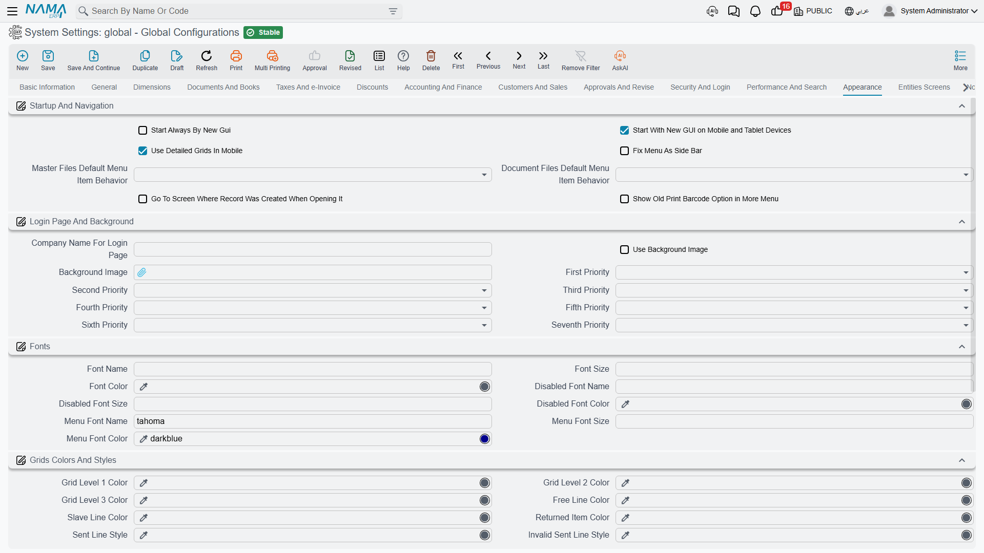
Startup and navigation
Start Always by New GUI value.info.startAlwaysByNewGui (default on) — Web sessions open the modern interface rather than the legacy one.
Start in Mobile by New GUI value.info.startInMobileByNewGui (default on) — The same decision for mobile browsers.
Use Detailed Grids in Mobile value.info.useDetailedGridsInMobile (default on) — Mobile shows full grids instead of the compact card layout. Detailed grids carry more information; cards are easier to tap. Choose by what your mobile users actually do — reviewing figures wants grids, capturing a few fields wants cards.
Fix Menu as Side Bar value.info.fixMenuAsSideBar — Pins the main menu open as a sidebar instead of letting it collapse. Good on wide screens where users navigate constantly.
Master Files Default Menu Item Behavior value.info.mfDefaultMenuItemBehavior — What happens when a user picks a master file from the menu: List View opens the list of existing records, New Record opens a blank one. List View suits reference data people look things up in; New Record suits files that are mostly created.
Documents Default Menu Item Behavior value.info.docDefaultMenuItemBehavior — The same for document menu items. Data-entry heavy installations often set documents to New Record and master files to List View.
Should Redirect Edit View value.info.shouldRedirectEditView — When a record has a custom edit view defined, opening it redirects there instead of showing the standard screen.
Show Old Barcode Menu value.info.showOldBarcodeMenu — Keeps the legacy barcode menu visible. Only needed where an older barcode workflow is still in use.
Login page and background
Company Name for Login Page value.info.companyNameForLoginPage — The name shown on the login screen.
Use Background Image value.info.useBackgroundImage and Background Image backgroundImage — Whether to show a background picture, and the picture itself.
First Priority through Seventh Priority value.info.firstPriority … value.info.seventhPriority — A background image can be defined at seven levels: global configuration, legal entity, sector, branch, department, analysis set, and the individual user. These seven slots put those levels in order, and the system uses the first one that actually has an image. Put User first if you want people to personalise their own background but fall back to the company image when they haven't; put Legal Entity first in a group of companies where each subsidiary must show its own branding.
Fonts
Font Name / Font Size / Font Color value.info.fontInfo.fontName, ...fontSize, ...fontColor — The main interface font.
Disabled Font Name / Size / Color value.info.fontInfo.disabledFontName, ...disabledFontSize, ...disabledFontColor — How disabled fields are rendered. Worth setting deliberately: users need to tell at a glance that a field is read-only, and a grey that is too light reads as "broken" rather than "locked".
Menu Font Name / Size / Color value.info.fontInfo.menuFontName, ...menuFontSize, ...menuFontColor — The menu font.
Grid colours and styles
Nama uses colour to carry meaning inside grids. These settings decide what each meaning looks like.
Grid Level 1 / 2 / 3 Color value.info.gridLevel1Color, ...gridLevel2Color, ...gridLevel3Color — Row colours for the three nesting levels of a detail grid, so a reader can see at a glance which lines belong to which parent.
Free Line Color value.info.freeLineColor — Lines carrying free items.
Slave Line Color value.info.slaveLineColor — Lines generated as children of another line.
Returned Item Color value.info.returnedItemColor — Lines that have been returned.
Sent Line Style / Invalid Sent Line Style value.info.sentLineStyle, value.info.inValidSentLineStyle — Lines already sent to an external system, and those whose send failed validation. Choose two clearly different colours: telling "sent" from "sent but rejected" at a glance is the whole point.
Allow Text Wrap in Grids / in List Views value.info.allowTextWrapInGrids, value.info.allowTextWrapInListViews — Lets cell text wrap onto more than one line instead of being cut off. More readable, but fewer rows fit on screen.
Lines Count in Grids value.info.linesCountInGrids — The default number of rows per grid page.
Legacy UI Extra Styles value.info.legacyUIExtraStyles — Additional styling applied in the legacy interface, for installations that need a specific look there.
Popups and editors
Hide Select Column in Selector Popup value.info.hideSelectColumnInSelectorPopup — Removes the selection column from the record-picker popup.
Hide Count Column in Selector Popup value.info.hideCountColumnInSelectorPopup — Removes the count column from the same popup. Both trim a picker that users find crowded.
Always Use Text Area in Serial Popup value.info.alwaysUseTextAreaInSerialPopup — Serial entry always uses a multi-line box, which suits pasting a long list of scanned serials.
Do Not Use Descriptors in Fields value.info.doNotUseDescriptorsInFields — Reference fields show only code and name rather than the longer descriptor text. Turn it on where descriptors are so long they push the useful part of the field off screen.
Use Kendo Rich Editor value.info.useKendoRichEditor — Rich-text fields use the Kendo editor.
Create DMS Document in Popup Window value.info.createDMSDocInPopUpWindow (default on) — The "create DMS document" action opens in a popup instead of navigating away, so the user does not lose the record they were working on.
Tooltips
Tooltip Position value.info.tooltipPosition — Whether quick help appears above or below the field.
Pin Tool Tip value.info.pinToolTip — Keeps the tooltip open instead of fading, which helps while users are still learning a screen.